
Google Drive on the surface appears to be a place where you can store your files and the like, and while this is not an unfair thing to say the product goes beyond that as well. It is a suite of software and applications that are meant to compete with Microsoft Office, and one thing that Google has been doing for the past year or so is that it has been trying to change the aesthetics of these apps and turn them into something that would be a little more in line with the minimalist aesthetics that Google has started to become known for.
However, one change that had yet to come was in the Android apps that go with Google Drive, namely Google Docs, Google Sheets and all the rest of the apps that comprise this suite of software that is meant to make office work a lot easier than it would have been otherwise. These apps still had the old look, which meant that the app ecosystem lacked a fair amount of consistency which could make it confusing for some users to actually end up using the app the way it was meant to be used.
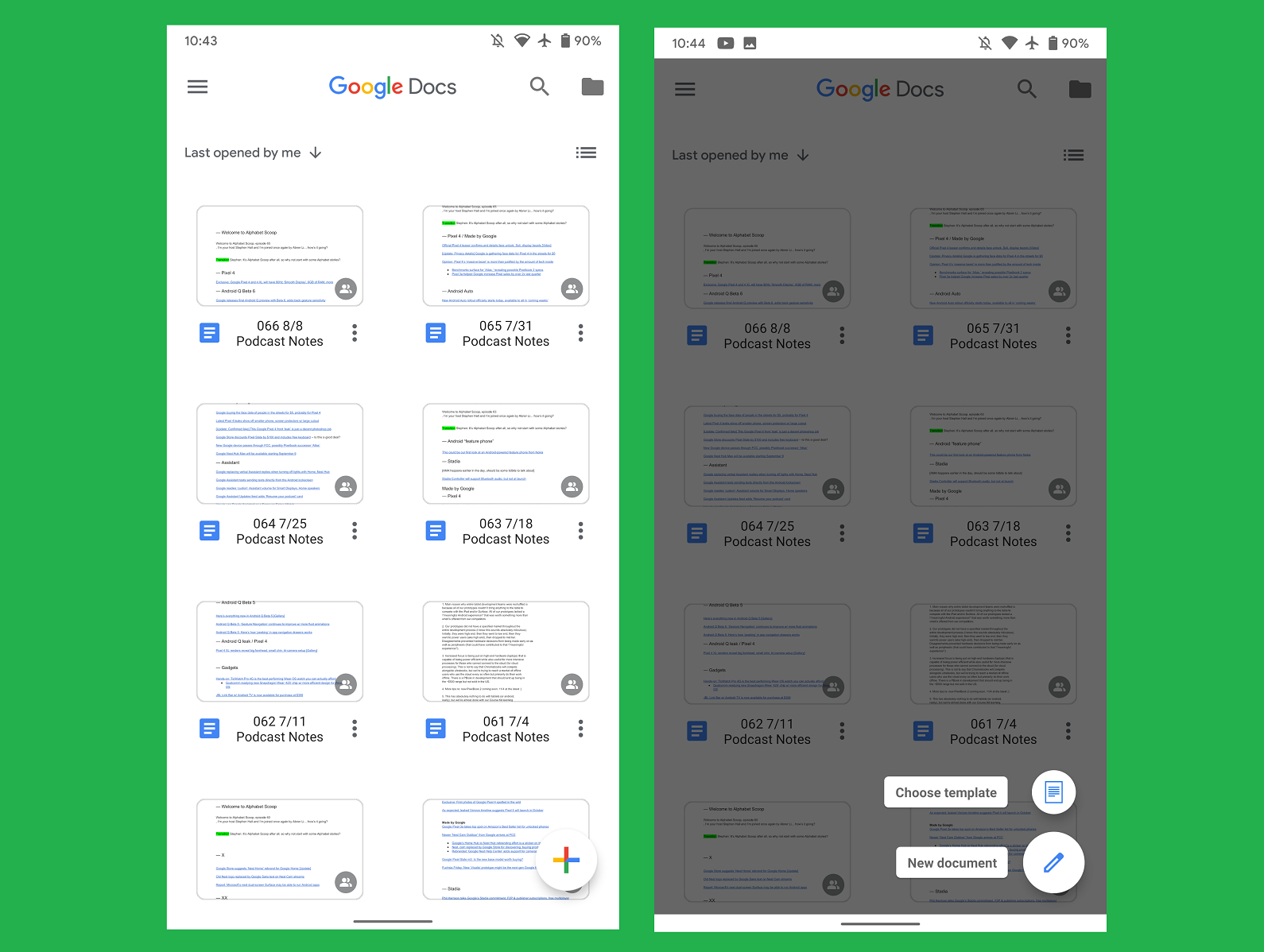
A lot of the functional elements that used to be in the side bar can now be found in the bottom bar, and the app bars are now without color. The multi colored Google Docs logo is now front and center, creating a bit of uniformity within these disparate functions for an application that is really only meant for one particular area even though this is a pretty big area and a market that could prove to be a game changer for a lot of companies.
Navigation is still pretty similar to what it used to be, which shows that Google didn’t go overboard with the redesign. Many tech companies change things up a little too much, so it’s heartening to know that Google didn’t end up doing the same thing.
H/T: 9to5Google.
Read next: Google Maps AR Walking Directions Are Out On Android & iPhone Now; With More Changes In Travel Section As Well
However, one change that had yet to come was in the Android apps that go with Google Drive, namely Google Docs, Google Sheets and all the rest of the apps that comprise this suite of software that is meant to make office work a lot easier than it would have been otherwise. These apps still had the old look, which meant that the app ecosystem lacked a fair amount of consistency which could make it confusing for some users to actually end up using the app the way it was meant to be used.
A lot of the functional elements that used to be in the side bar can now be found in the bottom bar, and the app bars are now without color. The multi colored Google Docs logo is now front and center, creating a bit of uniformity within these disparate functions for an application that is really only meant for one particular area even though this is a pretty big area and a market that could prove to be a game changer for a lot of companies.
Navigation is still pretty similar to what it used to be, which shows that Google didn’t go overboard with the redesign. Many tech companies change things up a little too much, so it’s heartening to know that Google didn’t end up doing the same thing.

H/T: 9to5Google.
Read next: Google Maps AR Walking Directions Are Out On Android & iPhone Now; With More Changes In Travel Section As Well