
YouTube is changing its desktop interface to take after the mobile version much more closely, particularly where comment sections are concerned.
YouTube’s comment sections are a lively hubbub of activity, or a raging scream fest of conflicting opinions that all involved parties will defend to the death without budging the slightest. Always fun when the options are cool headed commentary about the video, or someone defending the Charlottesville rally. At any rate, YouTube comments are a minor, yet notable part of internet history, since they’re probably the first ever instance of miniature forums. Before YouTube, discussing certain topics required either elaborate chat rooms or message boards where sorting through different topics required going through fifty pages’ worth of content. YouTube decided to neatly compile all user comments in a single, scrolling format underneath the related video itself, eliminating the need for any extra links or forums. Not exactly an innovation of the century, but they’re an important part of the internet that users take for granted.
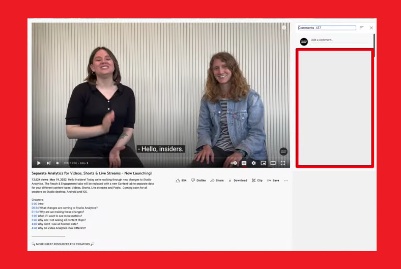
So, what’s this new interface that everyone’s discussing? Well, in a recent Creator Insider video, where YouTube’s devs delve into new and upcoming changes or tweaks to either the platform itself or adjacent material (i.e. community guidelines, sponsorship regulations), the comments panel was brought up. YouTube’s mobile and desktop versions have notably different interpretations of what is essentially the same concept. The desktop version, which I imagine everyone is most familiar and comfortable with (because I’m a bona fide 90’s kid), just has the comments splayed out right underneath the video for one’s viewing purposes. The biggest innovation introduced to them has been the ability to scroll down to the comments section while also being in full-screen. The mobile interface, however, doesn’t have comments fully laid out. It has a singular top comment being displayed, with the rest of them only opening up to a user if they tap on said comment.
Either YouTube’s devs or the community really took to the latter display, because a very similar version of it is now being introduced to the desktop site as well. YouTube for desktops will now feature a comment section displaying only a singular, top comment. Clicking on it will open up the entire comment section for the community to peruse at their own leisure. The only difference between the mobile and web interface is that the comment section opens up below the video in the former, while it opens to the right of the video in the latter.

 Read next: YouTube Struggles With Misinformation As Falsehoods Relating To Controversial Issues Surge On The Platform
YouTube’s comment sections are a lively hubbub of activity, or a raging scream fest of conflicting opinions that all involved parties will defend to the death without budging the slightest. Always fun when the options are cool headed commentary about the video, or someone defending the Charlottesville rally. At any rate, YouTube comments are a minor, yet notable part of internet history, since they’re probably the first ever instance of miniature forums. Before YouTube, discussing certain topics required either elaborate chat rooms or message boards where sorting through different topics required going through fifty pages’ worth of content. YouTube decided to neatly compile all user comments in a single, scrolling format underneath the related video itself, eliminating the need for any extra links or forums. Not exactly an innovation of the century, but they’re an important part of the internet that users take for granted.
So, what’s this new interface that everyone’s discussing? Well, in a recent Creator Insider video, where YouTube’s devs delve into new and upcoming changes or tweaks to either the platform itself or adjacent material (i.e. community guidelines, sponsorship regulations), the comments panel was brought up. YouTube’s mobile and desktop versions have notably different interpretations of what is essentially the same concept. The desktop version, which I imagine everyone is most familiar and comfortable with (because I’m a bona fide 90’s kid), just has the comments splayed out right underneath the video for one’s viewing purposes. The biggest innovation introduced to them has been the ability to scroll down to the comments section while also being in full-screen. The mobile interface, however, doesn’t have comments fully laid out. It has a singular top comment being displayed, with the rest of them only opening up to a user if they tap on said comment.
Either YouTube’s devs or the community really took to the latter display, because a very similar version of it is now being introduced to the desktop site as well. YouTube for desktops will now feature a comment section displaying only a singular, top comment. Clicking on it will open up the entire comment section for the community to peruse at their own leisure. The only difference between the mobile and web interface is that the comment section opens up below the video in the former, while it opens to the right of the video in the latter.
