
Color psychology is all about how particular colors affect human behaviour. In the digital world, the way brands utilize a color palette says a lot about how they want their customers to feel.
Ever noticed that a lot of car brands, like Toyota or Audi, incorporate more silver-like shades with a hint of red? That’s because together, these symbolize high-quality workmanship and power. Blue is often used by pharmaceutical companies because of its common association with cleanliness, stability, and health.
Colors have hidden meanings, so what do you want yours to say about you?
Colors actually help consumers store and process images and information more efficiently, which increases brand recognition and likeability. If we think about big brands like Coca-Cola, we immediately picture the red can with fancy writing because that imagery has become embedded into our minds.
Let’s take it a step further and talk about the importance of color on revenue. The right palette will encourage emotions that lead to action. Beamax is a company that experimented with its colors to see if they really made a difference – and found a 53.1% increase in clicks on a red link compared to a blue link!
Now that we know just how impactful they can be, let’s get into choosing the best colors for your website to help build your brand personality.
Choosing the right primary colors for your business helps consumers quickly identify your brand. This staple palette can then be incorporated into your logo, along with the secondary colors that we’ll talk about below.
Using a color wheel is a great way to find those flattering shades to contrast your primary palette. Complimentary colors are located directly opposite each other, and you’ll notice that the three primary colors sit on each point of the triangle.
One example of a well-known brand that successfully used a pop of color in its logo is Google. The tech giant uses all three primary colors for each letter of its logo, but adds a pop of green on one of the letters to show it doesn’t always follow the rules! This childlike palette also makes technology seem more playful, rather than boring and complex.

Caption: Google incorporates a long, green L in its logo to show that the tech giant is not afraid to break the rules a little!
The safest – and probably the most popular – option for your background would be to choose a white or gray-like shade. A more muted background allows text, images, and even highlighted links to stay easily visible.
A funky website background, on the other hand, may negatively impact your overall brand image – even if your main logo looks great.
But if you’re not a fan of the blank canvas option, your website could be an off-white color instead. This would still help differentiate your look, even if it’s just by a shade or two.
Apple’s infamous website is an awesome example of how a mute background lets everything else on the page grab your attention.
The easiest choice to go for would be black, but you may be surprised to know that black typefaces aren’t actually very common. In fact, using black on a white background could lead to eye strain because of the full contrast of colors.
Going for a lighter shade, or a gray hue, provides a softer look without compromising on readability. Here’s an example of a navy-toned typeface against an off-white background, showing how well the two contrast with each other.
Ideally, we’d reserve colored typefaces for highlighted links or important pieces of information. However, choosing a formal color like navy, gray, or dark purple won’t be damaging to the overall appearance.
Use Consistent Saturation
What does this mean, exactly? Saturation is a fancier way of describing the brightness of a color. Although you’ll have an array of colors on display, it will all seem overwhelming for a consumer if some are brighter than others!
Highly saturated colors are used to make a brand appear vibrant and radiant, whereas less saturated colors create a more subtle, sophisticated, formal feel. Whichever you prefer, it’s always better to maintain consistency.
Have a look at this website design from Overflow:

Both shades of orange and dark blue are being utilized, yet no color overrides another because they have been kept at a similar saturation level.
Use the Same Color, but Vary Saturation
At first glance, thinking about using one color across your entire brand seems boring – but it can actually be a really smart move if you carefully vary the saturation.
This ecommerce product photography brand has a powerful connection with the color blue, which is seen all throughout its site. However, by altering saturation levels for elements like call-to-action buttons, Feedsauce enhanced its page without stepping outside its primary palette, keeping the brand highly recognisable.
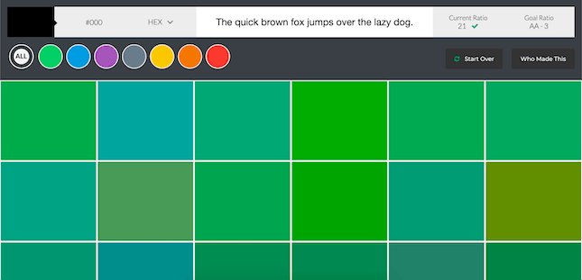
Color Safe – This is another really cool website that generates lots of colors for you to browse through. What’s great about this site is that you can look through the different shades of a single color to help find that perfect hue of green or purple!
1. Choose a primary color: This is what helps identify your brand straight away
2. Pick additional colors: These complement your primary color and add more personality to your brand
3. Choose a background color: This is the most noticeable color of your brand, so keep it simple to let everything else stand out
4. Choose a typeface color: This is the color of your text – we’d recommend a shade of gray to keep it soft and not too contrasting
Now it’s time to get the mood board out and start creating your iconic color palette! Feel free to check out Website Builder Expert’s infographic about it below:
")
About Author:
Ever noticed that a lot of car brands, like Toyota or Audi, incorporate more silver-like shades with a hint of red? That’s because together, these symbolize high-quality workmanship and power. Blue is often used by pharmaceutical companies because of its common association with cleanliness, stability, and health.
Colors have hidden meanings, so what do you want yours to say about you?
Why Are Website Colors So Important?
We briefly mentioned that colors trigger certain emotions from readers, but it goes as far as 85% of people claiming that color has a major influence on their buying decisions.Colors actually help consumers store and process images and information more efficiently, which increases brand recognition and likeability. If we think about big brands like Coca-Cola, we immediately picture the red can with fancy writing because that imagery has become embedded into our minds.
Let’s take it a step further and talk about the importance of color on revenue. The right palette will encourage emotions that lead to action. Beamax is a company that experimented with its colors to see if they really made a difference – and found a 53.1% increase in clicks on a red link compared to a blue link!
Now that we know just how impactful they can be, let’s get into choosing the best colors for your website to help build your brand personality.
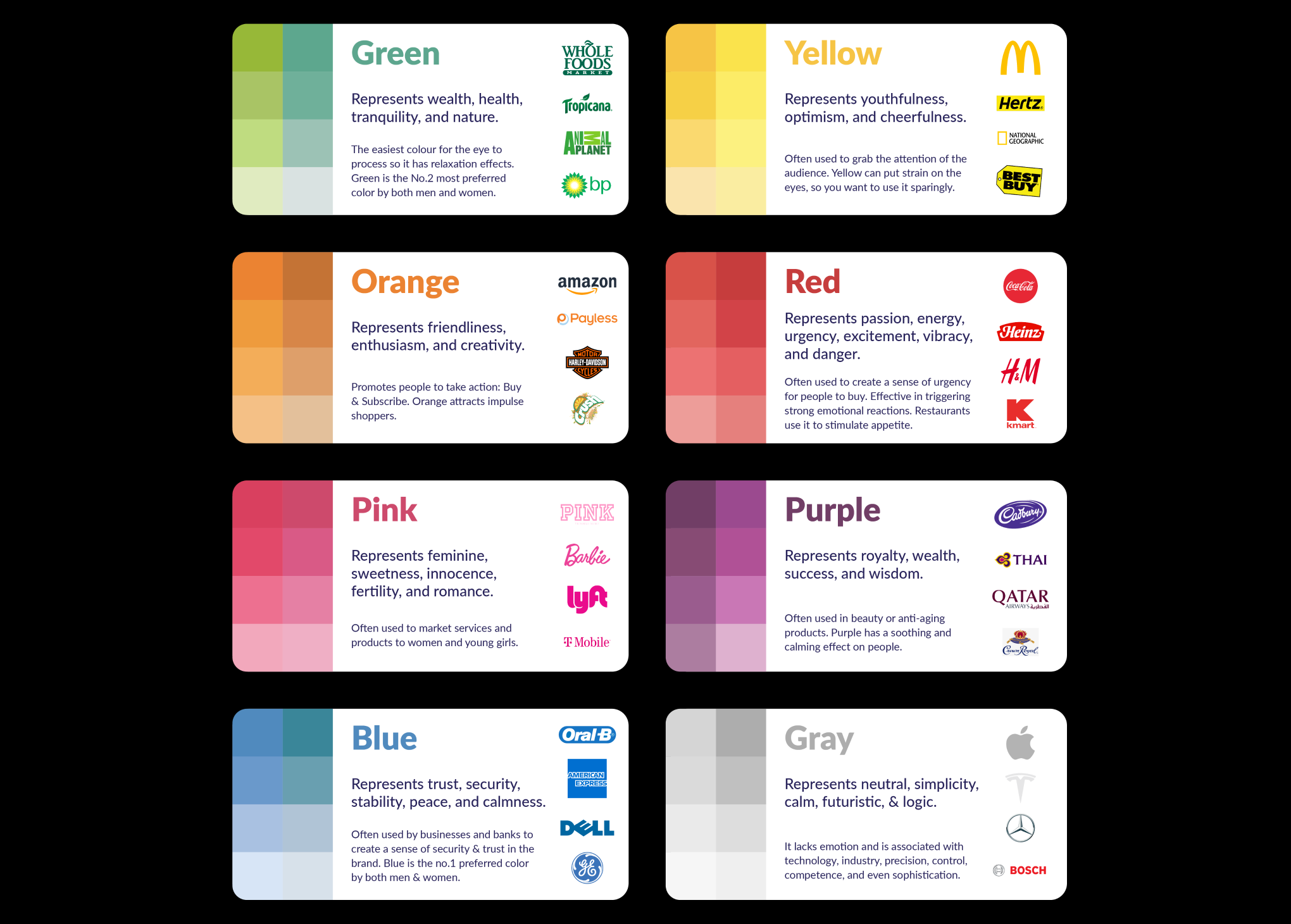
Step 1: Choosing a Primary Color
Primary colors reflect the overall vibe of your product or service. They’re a good indication of the industry you fit in and the intention of your business or brand. Here are some examples of what each primary color represents:Choosing the right primary colors for your business helps consumers quickly identify your brand. This staple palette can then be incorporated into your logo, along with the secondary colors that we’ll talk about below.
2. Choosing Additional Colors
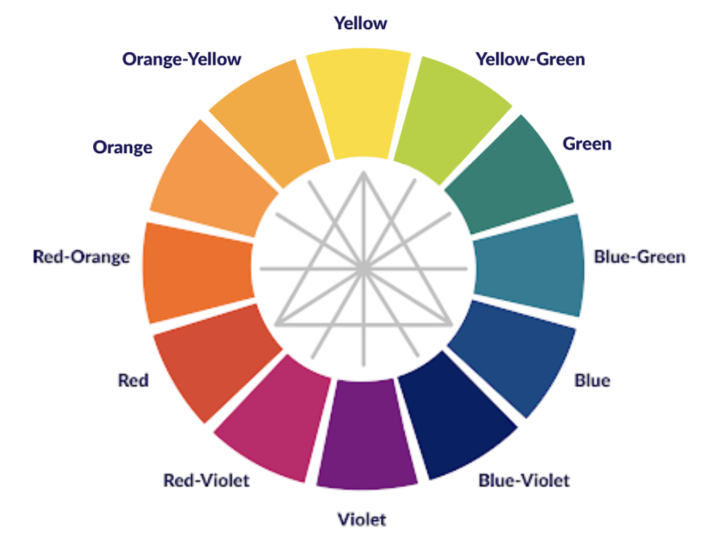
Now that you’ve selected your primary palette, it’s time to mix in some extra colors and let the creativity really flourish! These additional hues are known as ‘complimentary colors’ because their role is to make a brand’s personality stand out.Using a color wheel is a great way to find those flattering shades to contrast your primary palette. Complimentary colors are located directly opposite each other, and you’ll notice that the three primary colors sit on each point of the triangle.
One example of a well-known brand that successfully used a pop of color in its logo is Google. The tech giant uses all three primary colors for each letter of its logo, but adds a pop of green on one of the letters to show it doesn’t always follow the rules! This childlike palette also makes technology seem more playful, rather than boring and complex.
Caption: Google incorporates a long, green L in its logo to show that the tech giant is not afraid to break the rules a little!
3. Choosing a Background Color
Choosing the right background color for your site is a task that often gets dismissed when making big branding decisions. But the reality is, your background takes up more space than any other color – so you want to make sure you get it right!The safest – and probably the most popular – option for your background would be to choose a white or gray-like shade. A more muted background allows text, images, and even highlighted links to stay easily visible.
A funky website background, on the other hand, may negatively impact your overall brand image – even if your main logo looks great.
But if you’re not a fan of the blank canvas option, your website could be an off-white color instead. This would still help differentiate your look, even if it’s just by a shade or two.
Apple’s infamous website is an awesome example of how a mute background lets everything else on the page grab your attention.
4. Choose a Typeface Color
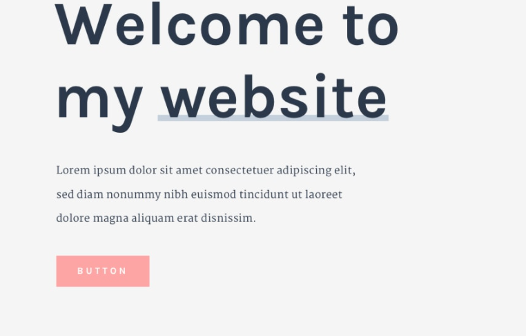
Typeface color dictates how light or heavy the text appears on a page. Being able to find the right balance of type color will do wonders for the readability of your text.The easiest choice to go for would be black, but you may be surprised to know that black typefaces aren’t actually very common. In fact, using black on a white background could lead to eye strain because of the full contrast of colors.
Going for a lighter shade, or a gray hue, provides a softer look without compromising on readability. Here’s an example of a navy-toned typeface against an off-white background, showing how well the two contrast with each other.
Ideally, we’d reserve colored typefaces for highlighted links or important pieces of information. However, choosing a formal color like navy, gray, or dark purple won’t be damaging to the overall appearance.
5. Expert Tips on Choosing Website Colors
Now that we’ve gone through all the main considerations in choosing a stunning color scheme, let’s have a look at some more expert tips to also keep in mind!Use Consistent Saturation
What does this mean, exactly? Saturation is a fancier way of describing the brightness of a color. Although you’ll have an array of colors on display, it will all seem overwhelming for a consumer if some are brighter than others!
Highly saturated colors are used to make a brand appear vibrant and radiant, whereas less saturated colors create a more subtle, sophisticated, formal feel. Whichever you prefer, it’s always better to maintain consistency.
Have a look at this website design from Overflow:
Both shades of orange and dark blue are being utilized, yet no color overrides another because they have been kept at a similar saturation level.
Use the Same Color, but Vary Saturation
At first glance, thinking about using one color across your entire brand seems boring – but it can actually be a really smart move if you carefully vary the saturation.
This ecommerce product photography brand has a powerful connection with the color blue, which is seen all throughout its site. However, by altering saturation levels for elements like call-to-action buttons, Feedsauce enhanced its page without stepping outside its primary palette, keeping the brand highly recognisable.
Further Useful Resources
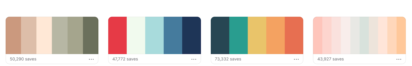
Coolors.co – If you’re not too sure where to get started with your color palette, this website generates some for you by lining up five different color codes at a time. Alternatively, you can use this site to explore trending palettes to help you get inspired!Color Safe – This is another really cool website that generates lots of colors for you to browse through. What’s great about this site is that you can look through the different shades of a single color to help find that perfect hue of green or purple!
Summary
That’s a wrap, folks! We’ve gone through all the steps to take when picking out your dream website color palette. Here’s a quick recap of each step:1. Choose a primary color: This is what helps identify your brand straight away
2. Pick additional colors: These complement your primary color and add more personality to your brand
3. Choose a background color: This is the most noticeable color of your brand, so keep it simple to let everything else stand out
4. Choose a typeface color: This is the color of your text – we’d recommend a shade of gray to keep it soft and not too contrasting
Now it’s time to get the mood board out and start creating your iconic color palette! Feel free to check out Website Builder Expert’s infographic about it below:
About Author:
Zara Choudhry writes for Website Builder Expert, a leading authority in helping people of all abilities build an online presence. Zara wants to make it as simple as possible for others to bring their ideas to life and to see the website building process as a progressive opportunity, rather than a digital barrier.
Read next: The Ideal Image Sizes for Social Media Ads, Profile and Cover in 2022 According to HootSuite
Read next: The Ideal Image Sizes for Social Media Ads, Profile and Cover in 2022 According to HootSuite