
Google’s putting in a bit of effort, attempting to declutter the overall aesthetic presented to users by the Chrome browser. The company’s adding in a new extensions menu, and changing the layout for current downloads.
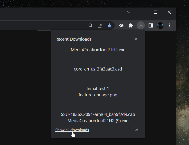
Downloads taking place on the Chrome browser appear in the form of a very noticeable bar that takes up a bit of one’s lower screen. It’s not the most obstructive visual in the world, but the bar can prove irksome, especially when scrolling down feeds or articles. It’s always just a tad bit irritating when someone has to scroll up a bit just to read three or four extra lines worth of content, just because something’s downloading and Google really, really wants you to know as soon as the process is done. There is an alternative, of course; users can simply click on the “show all downloads” option present on the bar’s extreme left hand side, which will lead to all downloads opening up in a new tab. Even that, however, is just cluttering up a neat space in a different way. Of course, all of these are less complaints and more just minor concerns; all of us want our browser interfaces to be as neat as possible, right? No need for extra tabs or obstructing updates. Google seems to agree, since it’s figured out a new method to display downloads, as per Leopeva64-2.
Now, downloads have their own dedicated toolbar icon which will display the same information that our current bar does. The way this works is that downloads are, for the most part, completely out of sight, and occurring in the background. If a user wants to keep tabs on how far they’ve come along, then all they have to do is click on the downloads tool in the toolbar, demarcated with the signature downwards pointing arrow. The “show all downloads” option is still available if users still want to open up their downloads in a separate tab, but the pesky little obstructive bar is no longer of concern to users.
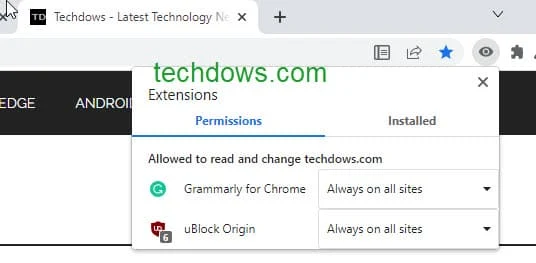
Extensions take up a lot of one’s toolbar as well, and they mostly just lie around until some form of use shows up. Sure, Honey’s useful and whatnot but how often is anyone shopping online? It’s not always necessary to have the extensions within an arrow’s click, and that’s where the new extensions menu shows up. Now, as spotted by TechDows, all extensions are neatly compiled under a single toolbar icon, much like downloads, and everything just looks all the neater for it.
Read next: Google Chrome reported 18x growth in multi-window adoption in foldable and tablets
Downloads taking place on the Chrome browser appear in the form of a very noticeable bar that takes up a bit of one’s lower screen. It’s not the most obstructive visual in the world, but the bar can prove irksome, especially when scrolling down feeds or articles. It’s always just a tad bit irritating when someone has to scroll up a bit just to read three or four extra lines worth of content, just because something’s downloading and Google really, really wants you to know as soon as the process is done. There is an alternative, of course; users can simply click on the “show all downloads” option present on the bar’s extreme left hand side, which will lead to all downloads opening up in a new tab. Even that, however, is just cluttering up a neat space in a different way. Of course, all of these are less complaints and more just minor concerns; all of us want our browser interfaces to be as neat as possible, right? No need for extra tabs or obstructing updates. Google seems to agree, since it’s figured out a new method to display downloads, as per Leopeva64-2.
Now, downloads have their own dedicated toolbar icon which will display the same information that our current bar does. The way this works is that downloads are, for the most part, completely out of sight, and occurring in the background. If a user wants to keep tabs on how far they’ve come along, then all they have to do is click on the downloads tool in the toolbar, demarcated with the signature downwards pointing arrow. The “show all downloads” option is still available if users still want to open up their downloads in a separate tab, but the pesky little obstructive bar is no longer of concern to users.
Extensions take up a lot of one’s toolbar as well, and they mostly just lie around until some form of use shows up. Sure, Honey’s useful and whatnot but how often is anyone shopping online? It’s not always necessary to have the extensions within an arrow’s click, and that’s where the new extensions menu shows up. Now, as spotted by TechDows, all extensions are neatly compiled under a single toolbar icon, much like downloads, and everything just looks all the neater for it.
Read next: Google Chrome reported 18x growth in multi-window adoption in foldable and tablets