
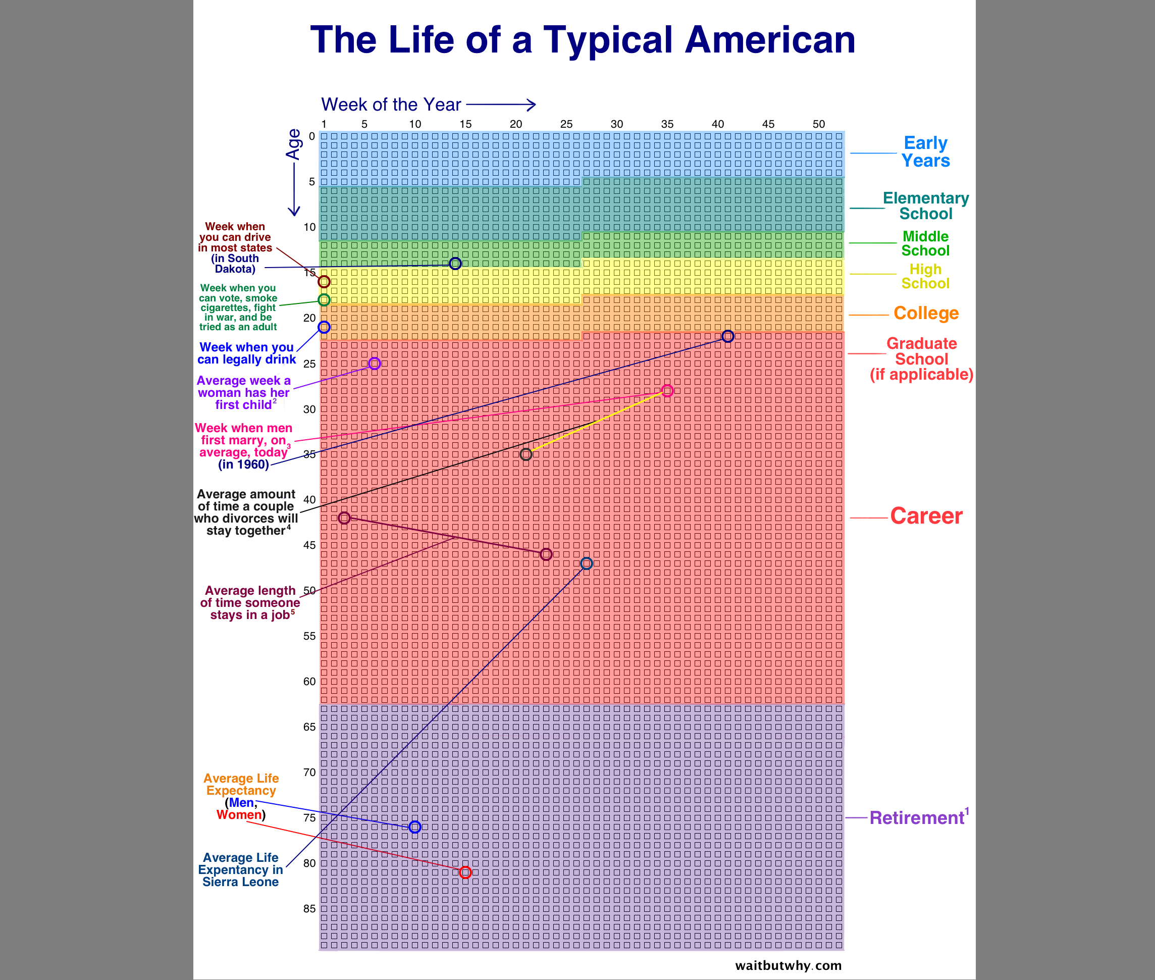
Well, 2021’s finally behind us. How do we celebrate the passage of yet another year? By lamenting our finite existence and checking out how many more we have left, of course! Enter the Your Life in Weeks infographic!
There’s something both alluring and mildly unsettling about trying to predict your life-span, possibly stemming from both curiosities of what lies ahead, and the fear of your future being so predictably set in stone. Your Life in Weeks is a rather thorough stab at providing such answers, giving individuals who purvey the chart a detailed account of their probable life, down to when they’ll finish college, start a job, and retire. While it’s fun to look at the graph in passing and crack a joke about how you started college early and therefore the information is completely inaccurate, further rumination (inadvisable as it is) comes to a singular conclusion: these are statistical facts. Whether you like it or not, statistically your life is expected to end at the same time as the graph predicts, and the span of your college life and career are variables that can be calculated beforehand. Have fun mulling over that for a while, and then start debating the role that determinism plays in your life. When you’re done, please don’t get bummed out, and keep reading this article since the revenue will really help me live out the rest of my predetermined life.
The Your Life in Weeks interactive infographic was developed by Sverrir Sigmundarson, head and singular staff member of the one-man software development studio Coruscant Consulting, which was originally inspired by WaitButWhy post. The graph doesn’t really have much of a point outside of posterity and reminding oneself that their days on this Earth are incredibly numbered. However, it’s still very well made; most other life expectancy websites just provide an arbitrary number, content in the fact that no one’s really going to ask further questions since no one really wants a serious answer. Corcuscant decided to go a few steps ahead, adding in the average span of one’s school life, college life, occupational life, and then retirement age. It also provides the information plotted in a near-graphical representation, with colors denoting these different time-periods of one’s life. All the infographic requires to plot this information is one’s birth date and year, alongside their country of residence.
I decided to check My Life in Weeks out in the interest of writing this article, amusedly thinking that it’ll give me some wildly inaccurate or speculative information (the latter of which is still correct). What I instead got is exactly something I’d expect of someone born on the same date as myself. As a kid of the late 90’s, I will start my professional career at the age of 26 (close enough, I guess), and retire at the illustrious age of 62. Following which, I will then die at the age of…62. Wow. Corcuscant states that I’ll be working for whatever time I have left on this planet. Allow me a moment to compose myself, and obsessively calculate how much I need to retire and how easily I can rob a bank to get that amount.
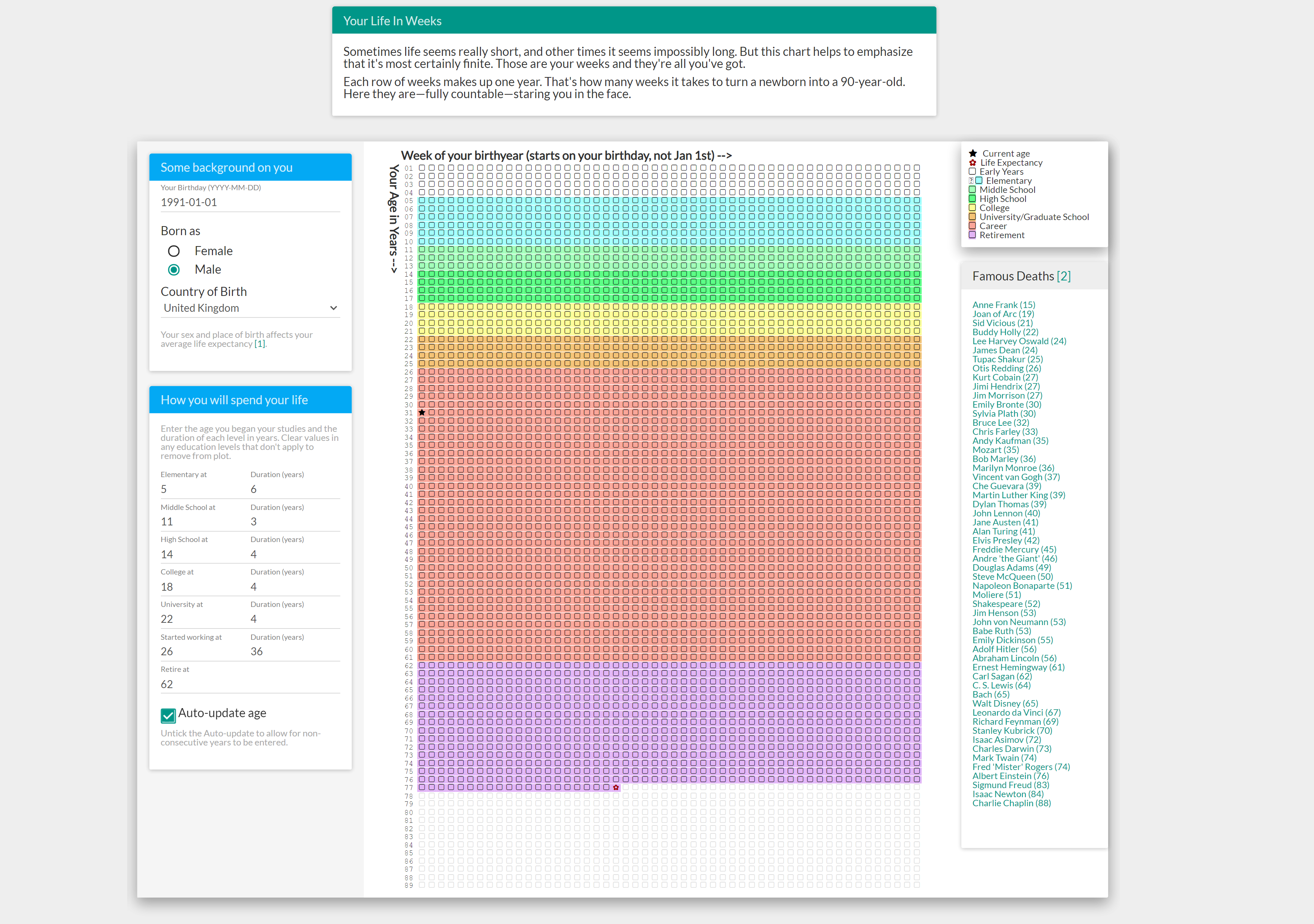
Jokes aside, here is the exact spot where one can point out the flaws in this infographic's design. Since people have different careers, some better paying than others, some with different benefits than others, it’s hard to accurately predict exactly how one’s retirement age, and by association life expectancy, will pan out. There’s a lot more information that needs to be factored in, and Your Life in Weeks was never built with the intention of doing so; it’s just a predictive infographic built upon statistical probability. However, stats come from a place of cold, hard fact, and the fact is that many individuals across the world will very much be working well into the twilight days of their life. Your Life in Weeks may be a representation of one’s potential lifespan, sure, but it’s also inevitably a demonstration of how late-stage capitalism has led to one’s entire life revolving around their work. Our elders afforded houses in their early 30’s, and had the ability to balance multiple jobs that put them through college. Imagine that! The ability of any number of jobs, let alone the one that we find incredibly difficult to navigate, to be able to pay for tuition! Here, Amazon barely lets its workers have bathroom breaks, and colleges leech students off of loans until they’ve got nothing but debt to work off until their 60’s, or even 70s.
Your Life in Weeks is an unsettling chart, yes, but not just because it outlines one’s life down to their career and education. It’s a representation of a capitalistic noose being drawn tighter and tighter around the working classes.
Read next: Hazardous Consoles: Gaming is fun for all but not for our planet
There’s something both alluring and mildly unsettling about trying to predict your life-span, possibly stemming from both curiosities of what lies ahead, and the fear of your future being so predictably set in stone. Your Life in Weeks is a rather thorough stab at providing such answers, giving individuals who purvey the chart a detailed account of their probable life, down to when they’ll finish college, start a job, and retire. While it’s fun to look at the graph in passing and crack a joke about how you started college early and therefore the information is completely inaccurate, further rumination (inadvisable as it is) comes to a singular conclusion: these are statistical facts. Whether you like it or not, statistically your life is expected to end at the same time as the graph predicts, and the span of your college life and career are variables that can be calculated beforehand. Have fun mulling over that for a while, and then start debating the role that determinism plays in your life. When you’re done, please don’t get bummed out, and keep reading this article since the revenue will really help me live out the rest of my predetermined life.
The Your Life in Weeks interactive infographic was developed by Sverrir Sigmundarson, head and singular staff member of the one-man software development studio Coruscant Consulting, which was originally inspired by WaitButWhy post. The graph doesn’t really have much of a point outside of posterity and reminding oneself that their days on this Earth are incredibly numbered. However, it’s still very well made; most other life expectancy websites just provide an arbitrary number, content in the fact that no one’s really going to ask further questions since no one really wants a serious answer. Corcuscant decided to go a few steps ahead, adding in the average span of one’s school life, college life, occupational life, and then retirement age. It also provides the information plotted in a near-graphical representation, with colors denoting these different time-periods of one’s life. All the infographic requires to plot this information is one’s birth date and year, alongside their country of residence.
I decided to check My Life in Weeks out in the interest of writing this article, amusedly thinking that it’ll give me some wildly inaccurate or speculative information (the latter of which is still correct). What I instead got is exactly something I’d expect of someone born on the same date as myself. As a kid of the late 90’s, I will start my professional career at the age of 26 (close enough, I guess), and retire at the illustrious age of 62. Following which, I will then die at the age of…62. Wow. Corcuscant states that I’ll be working for whatever time I have left on this planet. Allow me a moment to compose myself, and obsessively calculate how much I need to retire and how easily I can rob a bank to get that amount.
Jokes aside, here is the exact spot where one can point out the flaws in this infographic's design. Since people have different careers, some better paying than others, some with different benefits than others, it’s hard to accurately predict exactly how one’s retirement age, and by association life expectancy, will pan out. There’s a lot more information that needs to be factored in, and Your Life in Weeks was never built with the intention of doing so; it’s just a predictive infographic built upon statistical probability. However, stats come from a place of cold, hard fact, and the fact is that many individuals across the world will very much be working well into the twilight days of their life. Your Life in Weeks may be a representation of one’s potential lifespan, sure, but it’s also inevitably a demonstration of how late-stage capitalism has led to one’s entire life revolving around their work. Our elders afforded houses in their early 30’s, and had the ability to balance multiple jobs that put them through college. Imagine that! The ability of any number of jobs, let alone the one that we find incredibly difficult to navigate, to be able to pay for tuition! Here, Amazon barely lets its workers have bathroom breaks, and colleges leech students off of loans until they’ve got nothing but debt to work off until their 60’s, or even 70s.
Your Life in Weeks is an unsettling chart, yes, but not just because it outlines one’s life down to their career and education. It’s a representation of a capitalistic noose being drawn tighter and tighter around the working classes.
Read next: Hazardous Consoles: Gaming is fun for all but not for our planet