
Twitter is trying out a new Explore UI for its users, which seems to have taken inspiration from the TikTok interface and cleaning some other miscellaneous items out in the process.
TikTok mania continues to chug on forward at top speed, and somehow Twitter of all platforms is looking to get in on the action. Yes. A microblogging platform mostly popular with people in their mid-thirties that’s heavily reliant on word-based conversation is attempting to emulate the Gen Z lip-synching video streaming platform. No, you did not have a stroke, Twitter’s just trying very, very hard to remain relevant. In a climate where bad news and opinions are easily accessible literally anywhere, Twitter just comes off as a professional method of expressing said opinions. Which isn’t a bad thing; having a platform that serves as a more self-serious form of discourse is a good niche to occupy and Twitter’s microblogging status perfectly equips itself for such a task. If it just weren’t for the incessantly pestering neo-Nazis, far right groups, hatemongers, and Q’Anon taking a break from 4Chan to go elsewhere, we’d be set.
Then again, while Twitter still enjoys a sizeable audience and will probably continue to do so for years to come, maintaining relevancy in the current online era is paramount. It takes nothing more than a short slip in order to lose millions of followers in the process. WhatsApp’s policy update cost it a good chunk of its community, and while the platform still thrives (no doubt due to parent company Meta having the money to keep things afloat), its competitors Signal and Telegram have managed to swing themselves into relevancy. Twitter’s decision to update its interface via emulating TikTok, however, is not where my mind would have gone first. I must admit though, despite my earlier ridicule, the new interface looks really good.
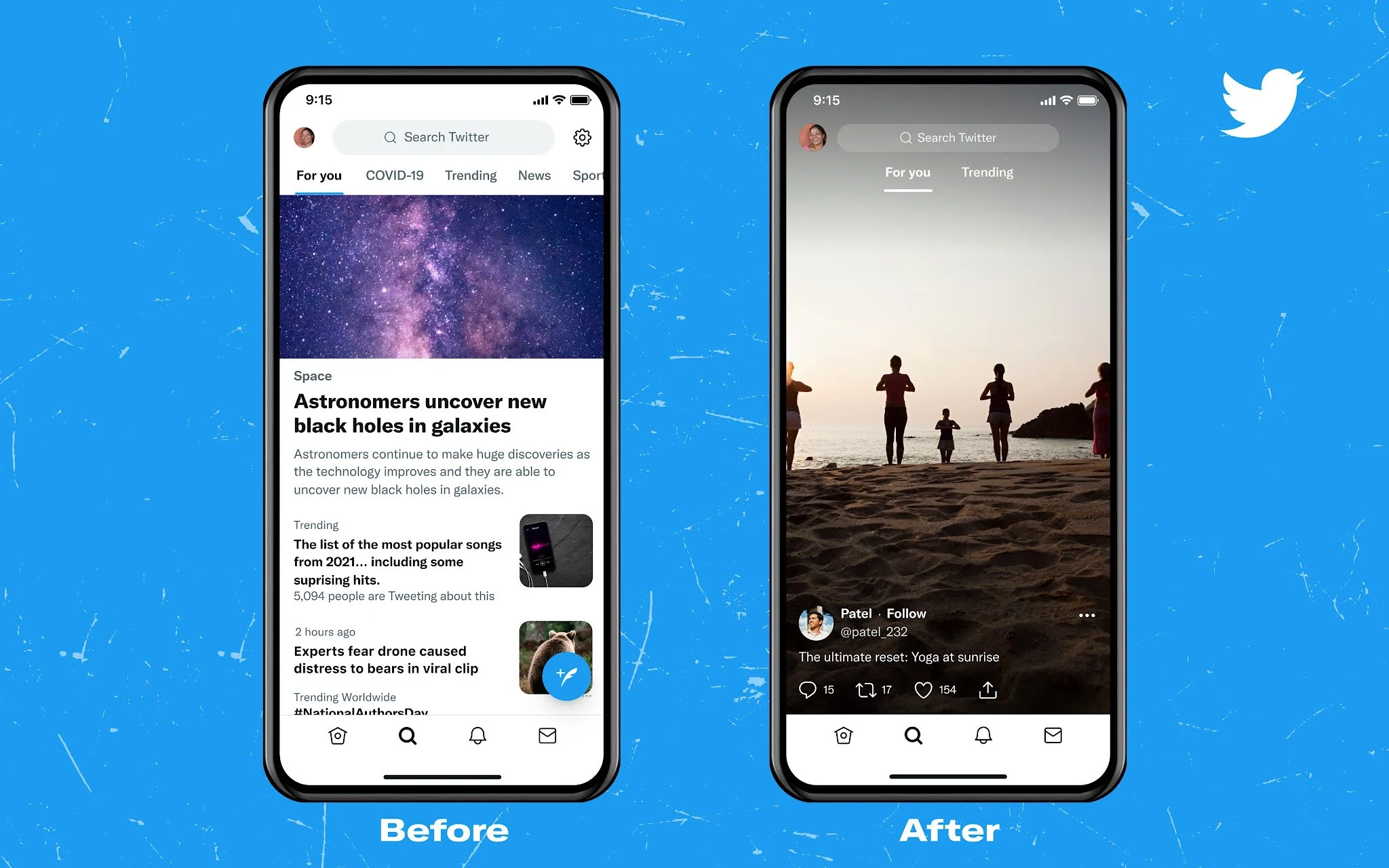
The Explore tab now displays itself in a vertical scrolling feed, where videos take up the entirety of one’s screen. This removes any excess unnecessary elements, and almost looks elegant, putting one’s phone screen to proper use. The Explore tab, once rife with so many different tags regarding Entertainment, Sports, COVID-19 News, and other such topics, now only has two left: For you, and Trending. It’s a simple change, but automatically declutters the entire space and leaves everything looking better for it. This almost feels reminiscent of Marie Kondo’s “spark joy” cleaning up method.
This new interface is currently undergoing trial, with A/B beta testing getting a feel for how users react. I feel like the reaction might end up being rather positive, even if everyone can quite literally see that the new UI was ripped off of TikTok.
Read next: Twitter’s Recent Doxing Policy Change Has Severely Underhanded and Exposed Anti-Fascist Groups on the Platform
TikTok mania continues to chug on forward at top speed, and somehow Twitter of all platforms is looking to get in on the action. Yes. A microblogging platform mostly popular with people in their mid-thirties that’s heavily reliant on word-based conversation is attempting to emulate the Gen Z lip-synching video streaming platform. No, you did not have a stroke, Twitter’s just trying very, very hard to remain relevant. In a climate where bad news and opinions are easily accessible literally anywhere, Twitter just comes off as a professional method of expressing said opinions. Which isn’t a bad thing; having a platform that serves as a more self-serious form of discourse is a good niche to occupy and Twitter’s microblogging status perfectly equips itself for such a task. If it just weren’t for the incessantly pestering neo-Nazis, far right groups, hatemongers, and Q’Anon taking a break from 4Chan to go elsewhere, we’d be set.
Then again, while Twitter still enjoys a sizeable audience and will probably continue to do so for years to come, maintaining relevancy in the current online era is paramount. It takes nothing more than a short slip in order to lose millions of followers in the process. WhatsApp’s policy update cost it a good chunk of its community, and while the platform still thrives (no doubt due to parent company Meta having the money to keep things afloat), its competitors Signal and Telegram have managed to swing themselves into relevancy. Twitter’s decision to update its interface via emulating TikTok, however, is not where my mind would have gone first. I must admit though, despite my earlier ridicule, the new interface looks really good.
Twitter is testing a NEW Explore Tab 🔎
— Matt Navarra (@MattNavarra) December 8, 2021
TikTok-style vertical scrolling FTW pic.twitter.com/KB2goa8ItA
The Explore tab now displays itself in a vertical scrolling feed, where videos take up the entirety of one’s screen. This removes any excess unnecessary elements, and almost looks elegant, putting one’s phone screen to proper use. The Explore tab, once rife with so many different tags regarding Entertainment, Sports, COVID-19 News, and other such topics, now only has two left: For you, and Trending. It’s a simple change, but automatically declutters the entire space and leaves everything looking better for it. This almost feels reminiscent of Marie Kondo’s “spark joy” cleaning up method.
This new interface is currently undergoing trial, with A/B beta testing getting a feel for how users react. I feel like the reaction might end up being rather positive, even if everyone can quite literally see that the new UI was ripped off of TikTok.
Read next: Twitter’s Recent Doxing Policy Change Has Severely Underhanded and Exposed Anti-Fascist Groups on the Platform