
Twitter's list of updates is getting longer by the second and we're not sure if its current design can handle all that.
Since Twitter has been announcing one update after the next as a way to reduce the monotony of the platform and increase the monetization policies, in turn bringing in more new users, it was time Twitter made some room for its newest updates. Twitter recently announced a few minor tweaks to the overlay in order to make the platform appear less crowded and easier to use.
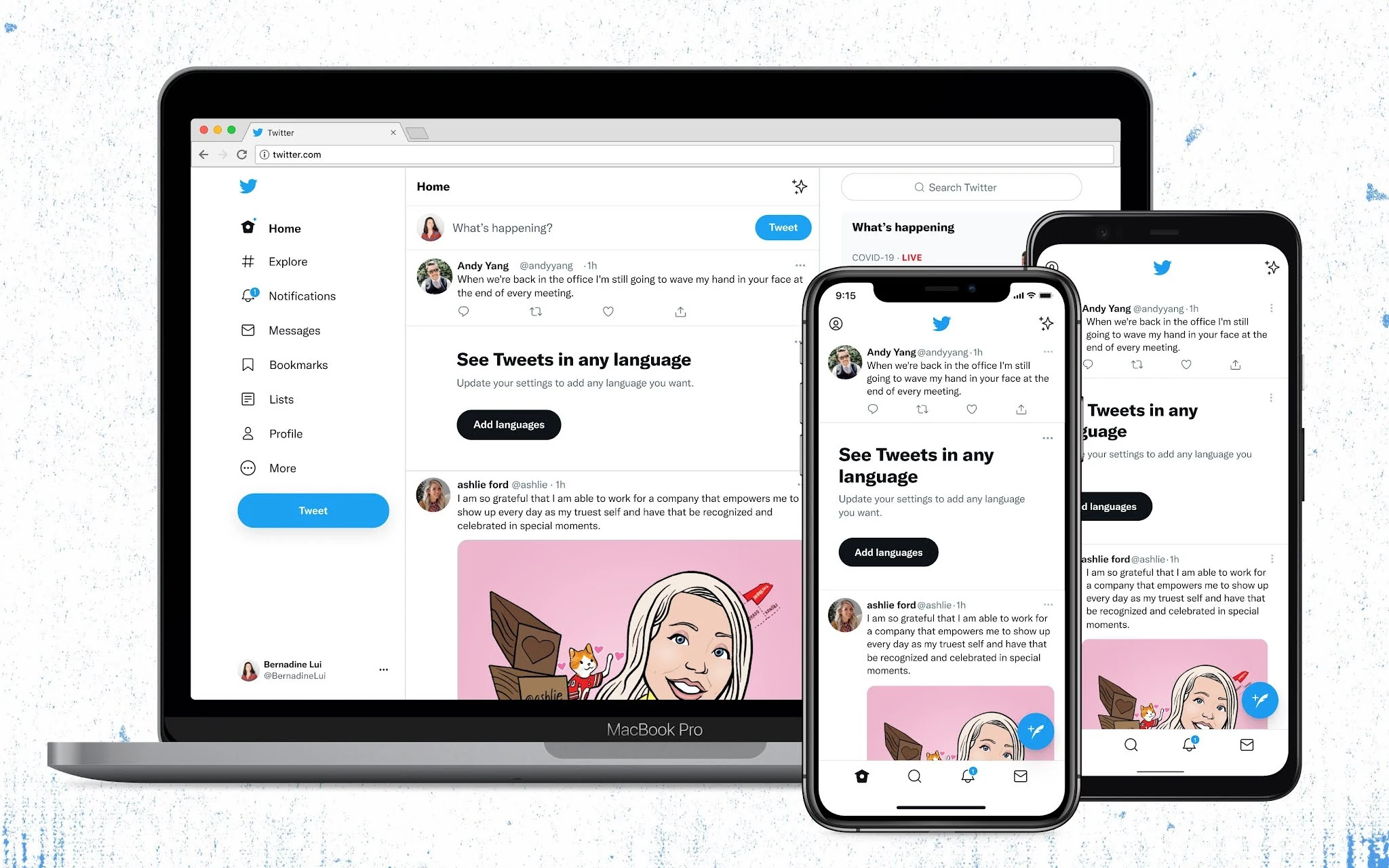
The new changes are aimed to increase accessibility while creating less of a clutter hence making the site easier to use. The main changes that Twitter aims to achieve include its official font, 'Chirp', along with increasing the color contrast and hopefully getting in a few new color palettes. The changes are applicable to both iOS and Android.
The biggest accomplishment for Twitter has to be Chirp here. The new font was announced back in January of this year. This was a major milestone for Twitter as it previously relied on various other fonts to get through, like all other platforms however it felt the need to have one to establish its own identity. By the launch of Chirp, Twitter will now have innumerable advantages, some of which include its own visual expression, a sharp and legible appearance, more platform personality, and a chance for higher brand advertising amongst other benefits. When the font was first introduced, it wasn't planned to make it the core element of the site however Twitter now claims the font to be one its crucial picks, absolutely essential for the brand image.
Furthermore, when it comes to fonts, Twitter decided to make all western language texts align at the same side - the left side. For more convenience, every text that is western will now appear on a single side although Twitter can't guarantee the result of those that aren't western.
Next, Twitter announced that its text colors are going to be way more vibrant with increased contrast. The buttons will showcase a similar change. The usual identifying element, the 'blue' color, will also be much less evident throughout the site. For instance, the tweets and the controls that were previously the usual Twitter color would now b featured as black. The highlight of the buttons might seem like a minor change at the time but in the midst of the new updates, it will play a rather significant role guiding users.
Twitter also mentioned the removal of all unnecessary elements that might add to the muddling of the page. For example, the platform claims to remove all the divider lines in between. It will get rid of the grey background as well as increase the space so that the text would have more space meaning it would be easier to read. All these changes will result in a much more versatile platform than what we are used to.
The list of updates that Twitter plans to launch is longer than the list of changes it has made therefore we're still a bit concerned if the platform will be able to accommodate it all without jumbling them up. These include Superfollow, Twitter Blue and such subscription services along with the love audio with Spaces. The e-commerce shopping and redesigned bookmarks might not seem as much but they will definitely contribute to making the platform livelier and definitely a tad more crowded as well.
While we are excited, only time can prove whether out concerns were needed or not. Twitter claims the new tweaks will make more room for the update and we cannot wait to find out.
Read next: Screenshots from a researcher provides additional details about the Twitter ‘Super Follower’ feature
Since Twitter has been announcing one update after the next as a way to reduce the monotony of the platform and increase the monetization policies, in turn bringing in more new users, it was time Twitter made some room for its newest updates. Twitter recently announced a few minor tweaks to the overlay in order to make the platform appear less crowded and easier to use.
The new changes are aimed to increase accessibility while creating less of a clutter hence making the site easier to use. The main changes that Twitter aims to achieve include its official font, 'Chirp', along with increasing the color contrast and hopefully getting in a few new color palettes. The changes are applicable to both iOS and Android.

The biggest accomplishment for Twitter has to be Chirp here. The new font was announced back in January of this year. This was a major milestone for Twitter as it previously relied on various other fonts to get through, like all other platforms however it felt the need to have one to establish its own identity. By the launch of Chirp, Twitter will now have innumerable advantages, some of which include its own visual expression, a sharp and legible appearance, more platform personality, and a chance for higher brand advertising amongst other benefits. When the font was first introduced, it wasn't planned to make it the core element of the site however Twitter now claims the font to be one its crucial picks, absolutely essential for the brand image.
Furthermore, when it comes to fonts, Twitter decided to make all western language texts align at the same side - the left side. For more convenience, every text that is western will now appear on a single side although Twitter can't guarantee the result of those that aren't western.
Next, Twitter announced that its text colors are going to be way more vibrant with increased contrast. The buttons will showcase a similar change. The usual identifying element, the 'blue' color, will also be much less evident throughout the site. For instance, the tweets and the controls that were previously the usual Twitter color would now b featured as black. The highlight of the buttons might seem like a minor change at the time but in the midst of the new updates, it will play a rather significant role guiding users.
Twitter also mentioned the removal of all unnecessary elements that might add to the muddling of the page. For example, the platform claims to remove all the divider lines in between. It will get rid of the grey background as well as increase the space so that the text would have more space meaning it would be easier to read. All these changes will result in a much more versatile platform than what we are used to.
The list of updates that Twitter plans to launch is longer than the list of changes it has made therefore we're still a bit concerned if the platform will be able to accommodate it all without jumbling them up. These include Superfollow, Twitter Blue and such subscription services along with the love audio with Spaces. The e-commerce shopping and redesigned bookmarks might not seem as much but they will definitely contribute to making the platform livelier and definitely a tad more crowded as well.
While we are excited, only time can prove whether out concerns were needed or not. Twitter claims the new tweaks will make more room for the update and we cannot wait to find out.
Read next: Screenshots from a researcher provides additional details about the Twitter ‘Super Follower’ feature