
In the following article, you are about to learn practical examples of website's initial situation, how we identify what is wrong, why it's wrong, what changes to implement, and how to get it done.

This stage focused on collecting some knowledge about the market, the customers and users, and the client's needs. The following topics were researched:
1. Home page
a. Creation of a new header – includes call-to-action buttons that should be more attractive to the user and a new banner that shows the product in "real life."

b. Call-to-action button for every product

2. Product page
a. Top of the page – a visible call-to-action button was added

b. Amazon widget was created to provide recommendations to new users who have not been introduced yet to the brand and its products

c. A Sticky Add to Cart Button throughout the entire product page was included
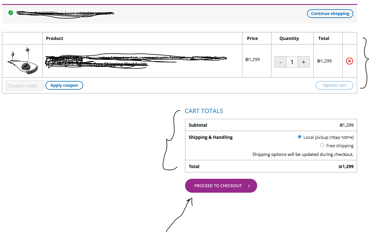
3. Cart:
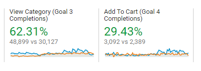
Add to cart goal – 286 products have been added = +28.83%
Newsletter signups – 160 = +23.08%
WhatsApp / Messenger chats – 76= +36%

Suppose your eCommerce website has conversion rate issues, and you struggle finding the solution, even after you’ve already increased your marketing budget. In that case, you should consider hiring a UX agency that can analyze the data and provide conclusions, followed by performing the recommended UX/UI modifications. You're more than welcome to contact Omnis Digital Agency! We are always here to assist you!
Good luck!
Case study #1 – eCommerce website from the amplifier industry
Data from the beginning of the project (30-day summary):
- Make a payment goal – 58 purchases
- Add to cart goal – 222 products have been added
- Newsletter signups – 130
- WhatsApp / Messenger chats – 56
What is wrong?
- The "subscribe" button had to be moved elsewhere; otherwise, it diverts the user's attention.
- The "buy" button had to be redesigned so that it would be more attractive to the user
- The images had to be reorganized since they appeared to be unclickable
- The "Stay Home" button had to be removed since it hid the other page’s elements
- The link had to be removed – the user could be thrown out from the cart page
- The Hebrew text had to be removed – high standards are to be kept at all times
- The "Proceed to checkout" button had to be redesigned in order to look noticeable and attractive to the user


What did we do?
Preliminary researchThis stage focused on collecting some knowledge about the market, the customers and users, and the client's needs. The following topics were researched:
- Customer's needs – per market, product, language, etc.
- What is the main goal of the website's users
- Market trends
1. Home page
a. Creation of a new header – includes call-to-action buttons that should be more attractive to the user and a new banner that shows the product in "real life."
b. Call-to-action button for every product
2. Product page
a. Top of the page – a visible call-to-action button was added
b. Amazon widget was created to provide recommendations to new users who have not been introduced yet to the brand and its products
c. A Sticky Add to Cart Button throughout the entire product page was included
3. Cart:
- A link attached to the product name was removed, to keep the user's focus on the add-to-cart function
- Checkout button display became bolder
- User-friendly checkout interface
What were the results following the changes?
Make a payment goal – 77 purchases = +32.76%Add to cart goal – 286 products have been added = +28.83%
Newsletter signups – 160 = +23.08%
WhatsApp / Messenger chats – 76= +36%
Case study #2 – eCommerce website from the fashion industry
What was wrong?
- There was no notification when a new user added a product to the cart
- There was no cashback feature
- There was no sales category
- There was no gift card feature
- No benefits from purchasing multiple products
- Decisions made based on gut-feeling and not preliminary user research
- There were no correct tags on the product page
- The Add-to-cart button wasn't sticky
What did we do?
- Add-to-cart notification was added when a user adds products to the cart
- A Cashback feature was added to the website to award the user for any purchased product
- A Sales category was created and the relevant products were marked with sale tags
- A Gift Card feature has been added to enable users to buy presents for their friends and family
- Free shipping became available as soon as the purchase amount reaches at least $ 100
- Preliminary user research has been conducted, and based on the collected data – features and UI elements were improved accordingly
- Add-to-cart sticky strip has been added to the product page
Suppose your eCommerce website has conversion rate issues, and you struggle finding the solution, even after you’ve already increased your marketing budget. In that case, you should consider hiring a UX agency that can analyze the data and provide conclusions, followed by performing the recommended UX/UI modifications. You're more than welcome to contact Omnis Digital Agency! We are always here to assist you!
Good luck!