
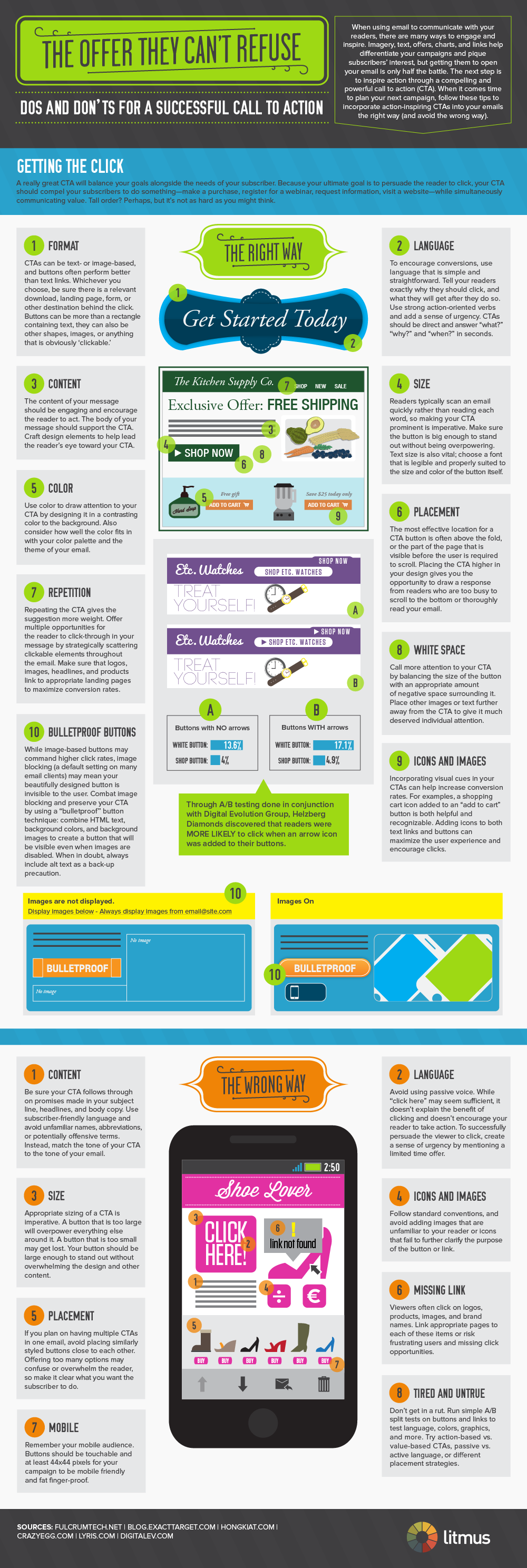
A really great CTA (call to action) will balance your goals along the needs of your subscriber. Because your ultimate goal is to persuade the reader to click, your CTA should compel your subscribers to do something - make a purchase, register for a webinar, request information, visit a website - while simultaneously communicating value. Tall order? Perhaps, but it's not as hard as you might think.
Format - CTAs can be text or image-based, and buttons often perform better than text links. Whichever you choose, be sure there is a relevant download, landing page, form, or other destination behind the click. Buttons can be more than a rectangle containing text, they can also be other shapes, images, or anything that is obviously 'clickable'.
Language - To encourage conversions, use language that is simple and straightforward. Tell your readers exactly why they should click, and what they will get after they do so. Use strong action-oriented verbs and add a sense of urgency. CTAs should be direct and answer 'what' 'why' and 'when'? in seconds.
The wrong way - Avoid using passive voice. While 'click here' may seem sufficient, it doesn't explain the benefit of clicking and doesn't encourage your reader to take action. To successfully persuade the viewer to click, create a sense of urgency by mentioning a limited time offer.
Content - The content of your message should be engaging and encourage the reader to act. The body of your message should support the CTA. Craft design elements to help lead the reader's eye toward your CTA.
The wrong way - Be sure your CTA follows though om promises made in your subject line, headline, and body copy. Use subscriber-friendly language and avoid unfamiliar names, abbreviations, or potentially offensive terms, Instead, match the tone of your CTA to the tone of your email. Viewers often click on logos, products, images and brand names. Link appropriate pages to each of these items or risk frustrating users and missing click opportunities
Size - Readers typically scan an email quickly rather than reading each word, so making your CTA prominent is imperative. make sure the button is big enough to stand out without being overpowering. Text size is also vital; choose a font that is legible and properly suited to the size and color of the button itself.
The wrong way - Appropriate sizing of a CTA is imperative. A button that is too large will overpower everything else around it. A button that is too small may get lost. Your button should be large enough to stand out without overwhelming the design and other content
Color - Use color to draw attention to your CTA by designing it in a contrasting color to be background. Also consider how well the color fits in with your color palette and the theme of your email.
Placement - The most effective location for a CTA button is often above the fold, or the part of the page that is visible before the user required to scroll. Placing the CTA higher in your design gives you the opportunity to draw a response from readers who are too busy to scroll to the button or thoroughly read your email.
The wrong way - If you plan on having multiple CTAs in one email, avoid placing similarly styled buttons close to each other. Offering too many options may confuse or even overwhelm the reader, so make it clear what you want the subscriber to do.
Repetition - Repeating the CTA gives the suggestion more weight. Offer multiple opportunities for the reader to click-through in your message by strategically scattering clickable elements throughout the email. make sure that logos, images, headlines, and products link to appropriate landing pages to maximize conversion rates.
White space - Call more attention to your CTA by balancing the size of the button with an appropriate amount of negative space surrounding it. Place other images or text further away from the CTA to give it much deserved individual attention.
Icons and images - Incorporating visual cues in your CTAs can help increase conversion rates. For examples, a shopping cart icon added to a 'add to cart' button is both helpful and recognizable. Adding icons to both text links and buttons can maximize the user experience and encourage clicks.
The wrong way - Follow standard conventions, and avoid adding images that are unfamiliar to your readers or icons that fail to further clarify the purpose of the button or link.
Bulletproof buttons - While image-based buttons may command higher click rates, image blocking (a default setting on may email clients) may mean your beautifully designed button is invisible to the user. Combat image blocking and preserve your CTA by using a 'bulletproof' button technique: combine HTML text, background colors, and background images to create a button that will be visible even when images are disable. When in doubt, always include "alt text" as a backup precaution. Remember your mobile audience. Buttons should be touchable and at least 44x44 pixels for your campaign to mobile friendly and fat finger-proof.
Tired and untrue
Don't get in a rut. Run simple A/B split tests on buttons and links to test languages, colors, graphics, and more. Try action-based vs value-based CTAs, passive vs active language, or different placement strategies.

Source : Litmus.
Format - CTAs can be text or image-based, and buttons often perform better than text links. Whichever you choose, be sure there is a relevant download, landing page, form, or other destination behind the click. Buttons can be more than a rectangle containing text, they can also be other shapes, images, or anything that is obviously 'clickable'.
Language - To encourage conversions, use language that is simple and straightforward. Tell your readers exactly why they should click, and what they will get after they do so. Use strong action-oriented verbs and add a sense of urgency. CTAs should be direct and answer 'what' 'why' and 'when'? in seconds.
The wrong way - Avoid using passive voice. While 'click here' may seem sufficient, it doesn't explain the benefit of clicking and doesn't encourage your reader to take action. To successfully persuade the viewer to click, create a sense of urgency by mentioning a limited time offer.
Content - The content of your message should be engaging and encourage the reader to act. The body of your message should support the CTA. Craft design elements to help lead the reader's eye toward your CTA.
The wrong way - Be sure your CTA follows though om promises made in your subject line, headline, and body copy. Use subscriber-friendly language and avoid unfamiliar names, abbreviations, or potentially offensive terms, Instead, match the tone of your CTA to the tone of your email. Viewers often click on logos, products, images and brand names. Link appropriate pages to each of these items or risk frustrating users and missing click opportunities
Size - Readers typically scan an email quickly rather than reading each word, so making your CTA prominent is imperative. make sure the button is big enough to stand out without being overpowering. Text size is also vital; choose a font that is legible and properly suited to the size and color of the button itself.
The wrong way - Appropriate sizing of a CTA is imperative. A button that is too large will overpower everything else around it. A button that is too small may get lost. Your button should be large enough to stand out without overwhelming the design and other content
Color - Use color to draw attention to your CTA by designing it in a contrasting color to be background. Also consider how well the color fits in with your color palette and the theme of your email.
Placement - The most effective location for a CTA button is often above the fold, or the part of the page that is visible before the user required to scroll. Placing the CTA higher in your design gives you the opportunity to draw a response from readers who are too busy to scroll to the button or thoroughly read your email.
The wrong way - If you plan on having multiple CTAs in one email, avoid placing similarly styled buttons close to each other. Offering too many options may confuse or even overwhelm the reader, so make it clear what you want the subscriber to do.
Repetition - Repeating the CTA gives the suggestion more weight. Offer multiple opportunities for the reader to click-through in your message by strategically scattering clickable elements throughout the email. make sure that logos, images, headlines, and products link to appropriate landing pages to maximize conversion rates.
White space - Call more attention to your CTA by balancing the size of the button with an appropriate amount of negative space surrounding it. Place other images or text further away from the CTA to give it much deserved individual attention.
Icons and images - Incorporating visual cues in your CTAs can help increase conversion rates. For examples, a shopping cart icon added to a 'add to cart' button is both helpful and recognizable. Adding icons to both text links and buttons can maximize the user experience and encourage clicks.
The wrong way - Follow standard conventions, and avoid adding images that are unfamiliar to your readers or icons that fail to further clarify the purpose of the button or link.
Bulletproof buttons - While image-based buttons may command higher click rates, image blocking (a default setting on may email clients) may mean your beautifully designed button is invisible to the user. Combat image blocking and preserve your CTA by using a 'bulletproof' button technique: combine HTML text, background colors, and background images to create a button that will be visible even when images are disable. When in doubt, always include "alt text" as a backup precaution. Remember your mobile audience. Buttons should be touchable and at least 44x44 pixels for your campaign to mobile friendly and fat finger-proof.
Tired and untrue
Don't get in a rut. Run simple A/B split tests on buttons and links to test languages, colors, graphics, and more. Try action-based vs value-based CTAs, passive vs active language, or different placement strategies.
Source : Litmus.