
Summer is upon us all and whether you love it or hate it - we’ve all got to live it.
Google Maps has recently sent out a surprise for its users around the globe with the launch of an air quality rating for your specific area.
The features coming just in time for the summer season.
In case you weren’t already aware, the hazardous effects of global warming and climate change, in general, have drastically affected us all. And that includes the air quality index that’s been added to home screens.
Last year, during the same time, we saw Nest Hub launch a similar update for all of their devices. It was located on the home screen, situated near the weather icon. Now, with a few weeks down the lane, Google has added similar functionality to its Maps.
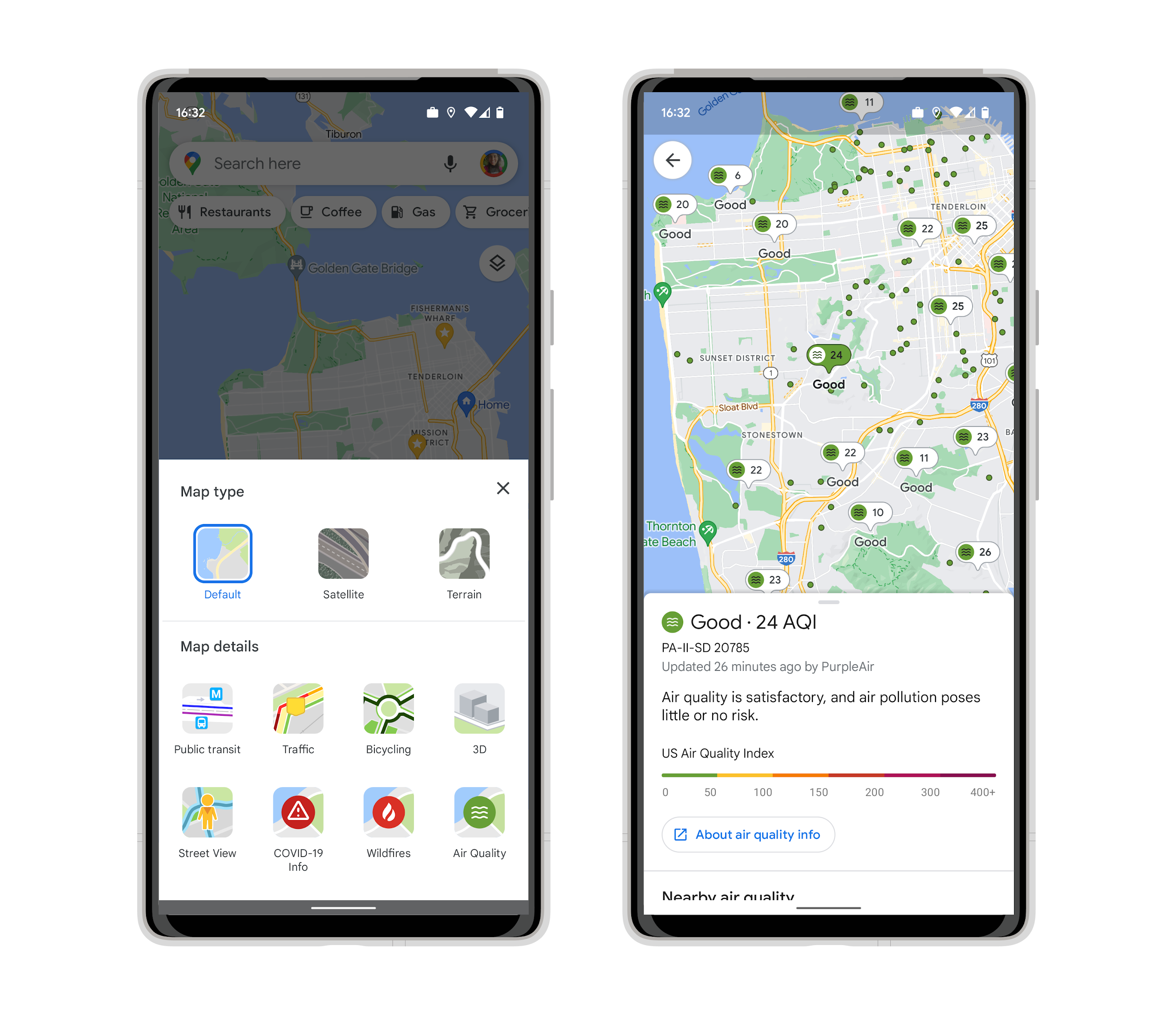
This is a map of air quality that showcase the ratings in any specific area and can be accessed through the menu bar.
This particular change was announced by the tech giant around one year ago. We’re seeing the ratings of air quality jump from zero to 400 and remember, the lower the figures, the better.
To take a look at the ratings present in Google Maps applications, simply click on the layers icon that’s present on the top right-hand side. Next, click on the Air Quality and that’s present right below the details for the Google Map.
The data is authentic and comes from sources like government agencies including the EPA. Other than that, you’ll also get a first-hand glance at the much hyped-up air quality index information provider named PurpleAir.
It’s interesting to see how Google is pretty behind its own schedule as this feature was supposed to be launched last year in March. Whatever the case may be, we’re super excited because this is some great news for health and weather enthusiasts.
Read next: Gaming Revenues Approached $200 Billion in 2021, Tencent Alone Crossed $32 Billion
Google Maps has recently sent out a surprise for its users around the globe with the launch of an air quality rating for your specific area.
The features coming just in time for the summer season.
In case you weren’t already aware, the hazardous effects of global warming and climate change, in general, have drastically affected us all. And that includes the air quality index that’s been added to home screens.

Last year, during the same time, we saw Nest Hub launch a similar update for all of their devices. It was located on the home screen, situated near the weather icon. Now, with a few weeks down the lane, Google has added similar functionality to its Maps.
This is a map of air quality that showcase the ratings in any specific area and can be accessed through the menu bar.
This particular change was announced by the tech giant around one year ago. We’re seeing the ratings of air quality jump from zero to 400 and remember, the lower the figures, the better.
To take a look at the ratings present in Google Maps applications, simply click on the layers icon that’s present on the top right-hand side. Next, click on the Air Quality and that’s present right below the details for the Google Map.
The data is authentic and comes from sources like government agencies including the EPA. Other than that, you’ll also get a first-hand glance at the much hyped-up air quality index information provider named PurpleAir.
It’s interesting to see how Google is pretty behind its own schedule as this feature was supposed to be launched last year in March. Whatever the case may be, we’re super excited because this is some great news for health and weather enthusiasts.
Read next: Gaming Revenues Approached $200 Billion in 2021, Tencent Alone Crossed $32 Billion