
Google is adding a few new features to the Search engine, such as a new method of looking at query answers along with the display of trending searches. Google’s also testing out a new display for visual stories.
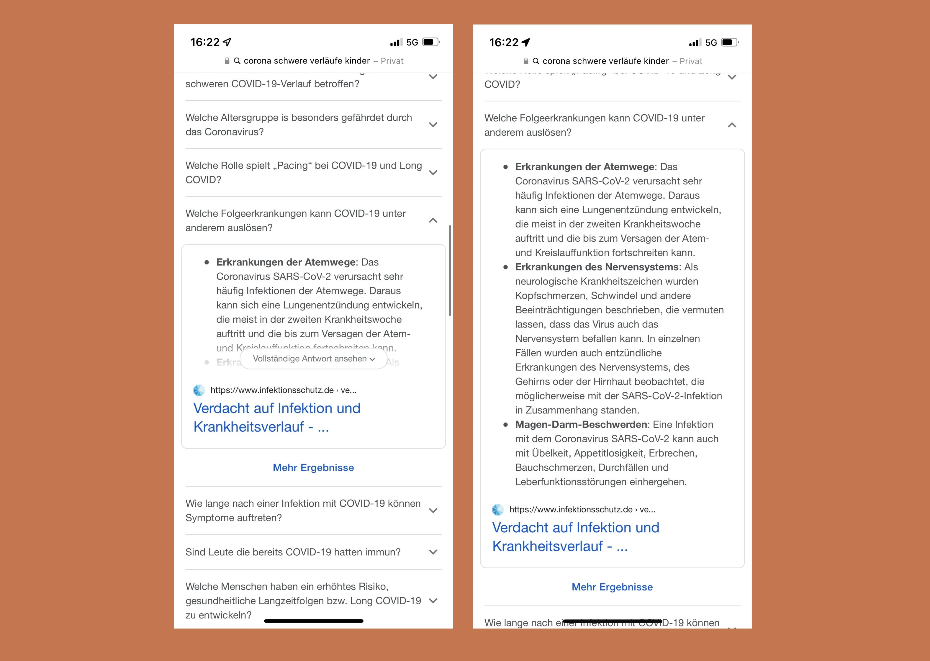
So, let’s start with the main reason any of us are familiar with Google in the first place: The Search engine. Google Search has been hailed time and time again as the savior of school students, undergrads, postgrads, college professors, and PhD candidates struggling with their thesis defenses alike. Search is quite literally synonymous with looking for, and often finding, answers. Therefore, it only makes sense that Google would go all-in on doing so more efficiently. Upon Googling something, the Search engine will identify keywords from a query, and then put up a list of common questions geared around those keywords. Not only that, but clicking on those questions will display the first search result for those questions, with the specific paragraph that harbors the relevant keywords. It’s a quick way of answering one’s questions without them even necessarily asking them directly in the first place. However, the answers are often brief excerpts from the first search result, which means that answers are often incomplete or cut out.
The first new addition, as spotted by Valentin Pletzer to Search is the presence of lengthier answers to the predicted queries. Now, upon clicking a query, Google will provide users with the option of expanding upon the answer. Doing so will provide a large portion of the webpage, allowing individuals to go through answers more properly and possibly avoid having to run through every other link on the Google Search page in order to find the answer they’re looking for. At any rate, it’s a rather minor convenience that’s been added to the mix, but it’s still a very useful feature that adds more depth to the Search engine and what it offers.
Another new addition, as per Jason Mandragona, is the way trending searches are displayed on Google Search. Typically, trending searches would show up in a list form, mostly when we just before we start typing anything in Google, but this time it's appearing as a fixed widget, with a very tiny blurb added underneath each individual trending topic. Not a bad method of displaying trending searches, but it does look a little messy and takes up an inordinate amount of space. Then again, the new interface isn’t exactly the most interesting looking either. Now, trending searches are displayed as small icons, placed in rows of three or less. The blurbs are no longer present, since the searches are now only displayed by the keywords and nothing else. That sort of takes away a user’s ability to gauge anything about the trending topic, until they click on it.

Finally, visual stories used to be displayed two in a row, with the preview images taking up more space across the Google Assistant app. However, a few test versions of the feature are revealing three-grid and four-grid versions of the display, allowing users to engage with and notice more content.
 H/T: @brodieseo
Read next: Google Executive Criticizes Apple & iMessage, Stating That The Platform’s Exclusivity Can Lead To Teenagers Being Bullied
So, let’s start with the main reason any of us are familiar with Google in the first place: The Search engine. Google Search has been hailed time and time again as the savior of school students, undergrads, postgrads, college professors, and PhD candidates struggling with their thesis defenses alike. Search is quite literally synonymous with looking for, and often finding, answers. Therefore, it only makes sense that Google would go all-in on doing so more efficiently. Upon Googling something, the Search engine will identify keywords from a query, and then put up a list of common questions geared around those keywords. Not only that, but clicking on those questions will display the first search result for those questions, with the specific paragraph that harbors the relevant keywords. It’s a quick way of answering one’s questions without them even necessarily asking them directly in the first place. However, the answers are often brief excerpts from the first search result, which means that answers are often incomplete or cut out.
The first new addition, as spotted by Valentin Pletzer to Search is the presence of lengthier answers to the predicted queries. Now, upon clicking a query, Google will provide users with the option of expanding upon the answer. Doing so will provide a large portion of the webpage, allowing individuals to go through answers more properly and possibly avoid having to run through every other link on the Google Search page in order to find the answer they’re looking for. At any rate, it’s a rather minor convenience that’s been added to the mix, but it’s still a very useful feature that adds more depth to the Search engine and what it offers.
Another new addition, as per Jason Mandragona, is the way trending searches are displayed on Google Search. Typically, trending searches would show up in a list form, mostly when we just before we start typing anything in Google, but this time it's appearing as a fixed widget, with a very tiny blurb added underneath each individual trending topic. Not a bad method of displaying trending searches, but it does look a little messy and takes up an inordinate amount of space. Then again, the new interface isn’t exactly the most interesting looking either. Now, trending searches are displayed as small icons, placed in rows of three or less. The blurbs are no longer present, since the searches are now only displayed by the keywords and nothing else. That sort of takes away a user’s ability to gauge anything about the trending topic, until they click on it.
Finally, visual stories used to be displayed two in a row, with the preview images taking up more space across the Google Assistant app. However, a few test versions of the feature are revealing three-grid and four-grid versions of the display, allowing users to engage with and notice more content.
Read next: Google Executive Criticizes Apple & iMessage, Stating That The Platform’s Exclusivity Can Lead To Teenagers Being Bullied