
Infographics are a powerful data visualization tool that can present complex information in a digestible way and get your message across effectively. A well-designed infographic can be fun, colorful, and professional, inviting readers to engage with information that they may have ignored if it were presented as plain text.
 Unsplash / Fakurian Design
Infographics are relatively affordable to create, and in most cases you need only limited graphic design skills to make your own infographic. However, time and effort are still required to create infographics that are effective. In this article we’ll examine the steps that all infographic designers should follow.
The shareability of infographics makes creating them a popular link building tactic for companies of all sizes. Additionally, making use of infographics as part of an infographic link building campaign can be a powerful element of a comprehensive strategy for both global and local SEO.
There are plenty of infographic templates online that can help, whether you want to create a comparison infographic, a timeline infographic, or something else.
When designing any infographic, it’s important to keep two types of people in mind: webmasters who will post the content and potential customers who will see it.
Webmasters aren’t typically interested in helping you sell your product. Instead, they want to provide useful information to their users. The goal of your infographic should be to answer search intent, not to overtly hawk your product or service. If your infographic is too salesy there’s a good chance a webmaster will reject it.
Avoid mentioning your products directly, and steer clear of any promotional or salesy language. Instead, keep your infographic informative and interesting so it provides value to the person reading it.
However, you can brand your infographic so people associate it with your company.
They are nowhere near making any buying decisions, so avoid making the infographic brand heavy. Remember that you are not trying to sell your products at this stage. Instead, you are trying to raise awareness about your products and services.
What types of visual content are they making?
How do their infographics look aesthetically (including color schemes)?
What type of language are they using?
How are their social media followers reacting to their content?
Studying how your competition’s social media followers react is crucial because it will help you gauge how effective a certain infographic style is likely to be with your audience.
Even the most eye-catching and best-researched infographics will not necessarily attract the attention of your target audience, so try to determine the factors that make your competitors’ infographics successful and implement those same elements in your infographics.
Try this exercise: take a magazine in your industry and look at the design style they are using. Magazines typically put a lot of research into their designs, and if a magazine is selling well, you know that their designs and content are hitting the mark with potential customers in your industry.
Choose a title and find a logical flow for your key points. This will help guide you as you develop the infographic, and it will ensure the designers know the theme to follow throughout.
The following are some key steps to creating an effective outline for your infographic.
It can be effective to use your brand colors for the infographic. For example, if the primary color of your brand is a specific shade of green, make that exact shade of green the primary color of your infographic. Not only does this boost brand awareness, but it creates a cohesive color scheme across all your media.
The eyedropper tool in most design software will sample any color and reveal its exact RGB or CMYK breakdown so you can replicate it perfectly.
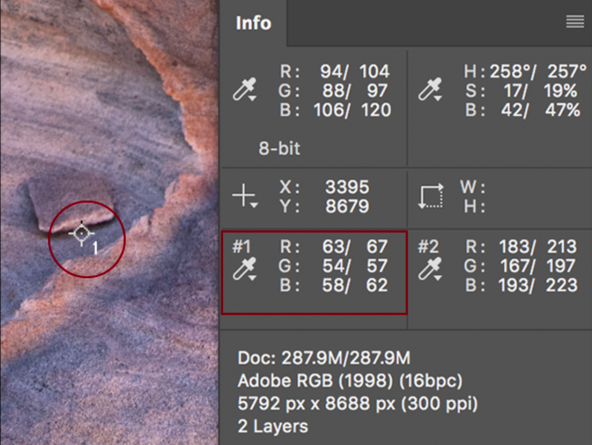
Image Source
Accompany your brand’s primary color with colors that complement it. To find your brand’s complementary colors, visit Coolors.co and insert the hex color code of your brand’s primary color. Then you can use the platform to generate a selection of colors that will be suitable for your infographic. It’s often best to choose two light, two medium, and two dark colors.
Your mood board should include examples of the illustrations and icons your infographic will contain.
You can also use infographics as content marketing tools by publishing them on other websites through guest blogging. This can be a great way to earn high-quality backlinks and boost your website in the SERPS. Remember that infographics can accompany blog posts and articles as well as stand on their own.
Speaking of which, below is a handy infographic that will tell you more about designing effective infographics that present your information well, direct readers to a CTA, and help you earn quality backlinks.

Read next: How the Web Hosting Industry Changed in 2021
Infographics are relatively affordable to create, and in most cases you need only limited graphic design skills to make your own infographic. However, time and effort are still required to create infographics that are effective. In this article we’ll examine the steps that all infographic designers should follow.
Why are infographics so important?
Not only do infographics help you present your message using as few words as possible, but users may be prompted to share them on social media. When your content is shared, you earn valuable backlinks that strengthen your domain authority and give your website a boost in the search engine results pages (SERPs).The shareability of infographics makes creating them a popular link building tactic for companies of all sizes. Additionally, making use of infographics as part of an infographic link building campaign can be a powerful element of a comprehensive strategy for both global and local SEO.
How to make an infographic
Infographics come in many forms. The type of infographic that is best for you will depend on the type of information you want to convey and how you want to present it to your readers.There are plenty of infographic templates online that can help, whether you want to create a comparison infographic, a timeline infographic, or something else.
When designing any infographic, it’s important to keep two types of people in mind: webmasters who will post the content and potential customers who will see it.
Webmasters
The immense shareability of infographics is arguably the number one reason to use them. So it follows that webmasters should be happy to post your infographic on their website.Webmasters aren’t typically interested in helping you sell your product. Instead, they want to provide useful information to their users. The goal of your infographic should be to answer search intent, not to overtly hawk your product or service. If your infographic is too salesy there’s a good chance a webmaster will reject it.
Avoid mentioning your products directly, and steer clear of any promotional or salesy language. Instead, keep your infographic informative and interesting so it provides value to the person reading it.
However, you can brand your infographic so people associate it with your company.
Potential customers
While webmasters must be appeased, your main objective is to create the best infographic to resonate with your target audience. Keep in mind that most people reading your infographic are at the top of your sales funnel. This means they are still at the awareness stage and have only just discovered your product and company.They are nowhere near making any buying decisions, so avoid making the infographic brand heavy. Remember that you are not trying to sell your products at this stage. Instead, you are trying to raise awareness about your products and services.
Do your research
When producing any type of content, including infographics, it’s a good idea to see what the competition is doing. To do this, find four to six infographics from your competitors and ask yourself:What types of visual content are they making?
How do their infographics look aesthetically (including color schemes)?
What type of language are they using?
How are their social media followers reacting to their content?
Studying how your competition’s social media followers react is crucial because it will help you gauge how effective a certain infographic style is likely to be with your audience.
Even the most eye-catching and best-researched infographics will not necessarily attract the attention of your target audience, so try to determine the factors that make your competitors’ infographics successful and implement those same elements in your infographics.
Try this exercise: take a magazine in your industry and look at the design style they are using. Magazines typically put a lot of research into their designs, and if a magazine is selling well, you know that their designs and content are hitting the mark with potential customers in your industry.
Develop an outline
You’re probably eager to get started on the visuals, but first you need to create an outline for your infographic. Your outline is important because it will help ensure that the final product delivers the right message and works visually.Choose a title and find a logical flow for your key points. This will help guide you as you develop the infographic, and it will ensure the designers know the theme to follow throughout.
The following are some key steps to creating an effective outline for your infographic.
1. Create a story
A good infographic leads its readers through a journey. Creating a narrative will help ensure the infographic sticks to the story and guides your readers.2. Keep it brief
Infographics should never be long-winded. After all, they’re meant to condense complex information into a format that’s easy to digest. Your readers won’t want to spend a long time reading your infographic, so keep it to a maximum of four sections.3. Keep text to a minimum
Infographics are a visual medium, so text should be minimal and used only to support the visuals when necessary. All text you do include should be carefully proofread, and there are plenty of free grammar check tools to help you spot mistakes.4. Always have a CTA
Every infographic should end with some type of call to action (CTA). It can be directions to more information, a link to a landing page, an invitation to subscribe to a mailing list, or a prompt to buy your product or service. CTAs are compelling and can drive a lot of traffic to your website.5. Describe your visuals
Go through and add a description of all the visuals you will be using. Text descriptions are fine at this stage, although quick sketches will help.Create a mockup wireframe
Developing a mockup wireframe based on the outline you created will help you start putting the pieces of your infographic together. Here are some tips to keep in mind.1. White space is your friend
When creating your wireframe, make sure to leave plenty of space between items to avoid clutter and help your readers flow easily through the infographic. Just because space is empty doesn’t mean it’s wasted. White or negative space helps your readers stay focused on what you want them to see.2. Keep it basic
Remember that you are not getting into the specifics of the design at this stage. Use simple shapes and colors to give you an idea of what the finished infographic will look like and ensure everything will be balanced, tidy, and flow well.Use a mood board
Create a mood board with your previous research in mind. A mood board will spark your creativity and help you experiment with the aesthetics of your infographic.1. Pick the right colors
Your mood board should include a color palette displaying the colors you determined worked best during the research stage. List the colors on the palette in order of priority from left to right.It can be effective to use your brand colors for the infographic. For example, if the primary color of your brand is a specific shade of green, make that exact shade of green the primary color of your infographic. Not only does this boost brand awareness, but it creates a cohesive color scheme across all your media.
The eyedropper tool in most design software will sample any color and reveal its exact RGB or CMYK breakdown so you can replicate it perfectly.
Image Source
Accompany your brand’s primary color with colors that complement it. To find your brand’s complementary colors, visit Coolors.co and insert the hex color code of your brand’s primary color. Then you can use the platform to generate a selection of colors that will be suitable for your infographic. It’s often best to choose two light, two medium, and two dark colors.
2. Showcase your fonts and images
At this stage, you need to consider which fonts your infographic will use. Make sure to avoid decorative, “flashy” fonts that might look cool but are difficult to read. Your infographic should be accessible to everyone, even if they have impaired vision. Also avoid overused fonts like Papyrus or Comic Sans that will get an eye-roll from graphic designers.Your mood board should include examples of the illustrations and icons your infographic will contain.
Design your infographic
Next is the design stage, where you take everything you’ve done so far and start putting the finished infographic together. Here are some tips on how to successfully translate your infographic from your imagination to the screen.1. Follow your wireframe
You created a wireframe for a reason, so make sure to use it. Your wireframe will help ensure that your infographic maintains a logical flow from start to finish.2. Remember to leave space
Ensure there’s plenty of space between items. If images, text, graphs, and other design elements are too close to each other, your infographic will be cluttered and difficult to read. Make sure the information is reduced to bite-sized chunks so your readers can easily consume it.3. Make it visually appealing
People are more likely to read your infographic if it’s aesthetically pleasing. Even if the information in your infographic is interesting and useful, a visually off-putting design can lose your audience fast. Most people will scan the infographic briefly before deciding whether to read it, so make sure all aspects are aesthetically pleasing.4. Maintain font hierarchy
Clearly arranging your headings, subheadings, and text in a logical hierarchy tells your reader which information is most important, and it directs their eye movement throughout your infographic. This helps them keep the ideas straight in their mind and avoid confusion as new information builds upon old.5. Include an embed code
An embed code will make it easy for webmasters to display your infographic on their website. Include it at the bottom of the page, where it’s clearly visible but unobtrusive.6. Avoid using thumbnails
If people have to click on a thumbnail to see your infographic, it creates an extra step that might prevent them from ever reading your infographic. Stick with using the full version where possible so people can clearly see it without having to take further action.Publish your infographic
Perhaps the best place to publish your infographic is on your social media channels because they will quickly help you reach a larger audience. Including it in social media posts also makes it easier for people to share your infographic.You can also use infographics as content marketing tools by publishing them on other websites through guest blogging. This can be a great way to earn high-quality backlinks and boost your website in the SERPS. Remember that infographics can accompany blog posts and articles as well as stand on their own.
Speaking of which, below is a handy infographic that will tell you more about designing effective infographics that present your information well, direct readers to a CTA, and help you earn quality backlinks.
Read next: How the Web Hosting Industry Changed in 2021