
Web design is a sector that constantly evolves and every year we discover new trends, formats and structures to create a web page.
The truth is that some of the trends in web design for 2018 have already begun to be seen.
In fact, I'm already putting some of them into practice in my latest works, as I'll show you in this post.
Although web design is not an exact science, I wanted to collect some of the trends that will be seen throughout the next year and that have already begun to be seen.
And the main trends in web design for 2018 are...
It is a trend that we have been seeing for a while and that will continue with us in 2018.
This type of designs stand out for the predominance of white or very clear backgrounds, a single color for typography and design with few elements.
It involves using the design elements strictly necessary to focus on the objective pursued by the website.
As you can see in this example, the design stands out for its cleanliness, light colors, simple typography and images with soft tones, very suitable for the whole.
In general, the sources that have a marked personal character will continue to gain strength in 2018 (we have been seeing them and using them for a while).
The "handmade" triumphs and these typographies give web design an exclusive personality, a different touch so necessary today.
They are thought like covers of a Web site and its result at visual level is very showy.
A couple of examples of mine, one of them the page about me of this blog.
In my opinion, they are a very cool effect, which gives a lot of dynamism to the design, but its use must be done with moderation so as not to overload the websites.
In short, animating certain elements, such as buttons, rows or drawers, gives a modern and innovative look, but it must be done with care.
I leave you a couple of own examples with animations:
Like the animations, I do not recommend overloading designs with gradients, but used with intelligence, they bring a very colorful and creative touch.
In this case, my recommendation is to make gradients with two colors, one main and one complementary.
Here you can see a design of mine on a landing page on the website!
In my opinion, every time we are going to go more towards exclusive designs in the mobile version of the websites.
That is, we are going to move from responsive design to our own designs on mobile devices.
What exactly does this technique consist of?
Surely you know what happens when certain elements of the web version are automatically adapted to the mobile, such as a header with full width.
Tired of adaptations with a "weird" result, I decided to create my own methodology, which consists of starting all the designs by the desktop version and, when everything is to my liking (or the client's), I went on to create the design for the mobile following the same model: images, colors, texts, etc.
A good example of this technique is my own website, where the adaptation of the superimposed blue boxes of the home was pretty bad on the mobile.
For that reason, from that moment I decided to start the designs for the desktop version and, when everything was to my liking, I started creating the mobile phone from scratch.
In short, it occurred to me to create this 'technique' to pay for the possible errors of the responsive design.
These are some of the web design trends that we will see in 2018, which are already beginning to be seen and which I have begun to apply in my latest works.
Bonus infographic:
![Space Odyssey to Web Design Trends 2018 [Infographic]](https://blogger.googleusercontent.com/img/b/R29vZ2xl/AVvXsEgk6uB6iFQ0SOZNACoEtmzkQlujDISrcMK9RXSuFGjV-_7q8NO3lSxFtwJetRHo4zU6GtLYh7-IDA1cK2K9h-lzGu68Q2Z7kecJcWpFGvHD-9poAqRe_gJIG-5Yt2cno6m8_09d1zAsCyU/s0-rw/) Source: Templatemonster.
Source: Templatemonster.
Which one do you prefer? Which is your favorite? Would you add any more trends?

The truth is that some of the trends in web design for 2018 have already begun to be seen.
In fact, I'm already putting some of them into practice in my latest works, as I'll show you in this post.
Although web design is not an exact science, I wanted to collect some of the trends that will be seen throughout the next year and that have already begun to be seen.
And the main trends in web design for 2018 are...
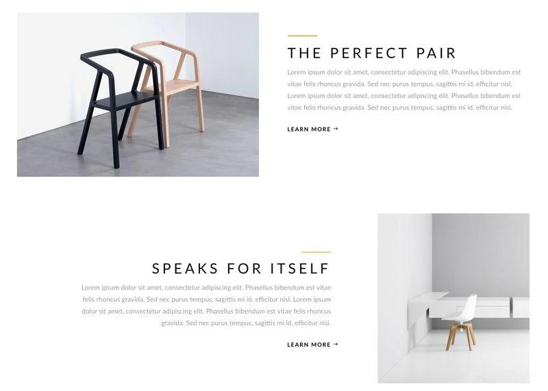
1. Minimalist, clean designs
Minimalism and simplicity are fashionable in web design. In short, less is more.It is a trend that we have been seeing for a while and that will continue with us in 2018.
This type of designs stand out for the predominance of white or very clear backgrounds, a single color for typography and design with few elements.
It involves using the design elements strictly necessary to focus on the objective pursued by the website.
As you can see in this example, the design stands out for its cleanliness, light colors, simple typography and images with soft tones, very suitable for the whole.
2. Handmade typefaces
Another element very fashionable in recent times and that will continue to be a trend during the next few months are handmade typefaces.In general, the sources that have a marked personal character will continue to gain strength in 2018 (we have been seeing them and using them for a while).
The "handmade" triumphs and these typographies give web design an exclusive personality, a different touch so necessary today.
As a recommendation, the best option to use these typefaces is to use them in the design of logos and in highlighted areas of the website, such as headers or headlines.
Here you can see two examples of the good use of handmade fonts at the top of the page.


It is a type of design in which each element is presented as an independent module, because it is inspired by the social network Pinterest.
That is, its main characteristic is that the design is based on independent elements with a square shape.
In addition, the design by modules is perfect for a correct adaptation to all devices (desktop, tablet and mobile).
I leave you a couple of examples with this technique so you can see its result visually.
If in previous years the tendency was to include slides with several images on the websites, little by little it has been lost, due to the time they need to be visualized and the large amount of resources they consume to be loaded.
For that reason, the trend for 2018 is full-width images to capture the user's attention with a single glance, also known as Heros.
Here you can see two examples of the good use of handmade fonts at the top of the page.
3) Modular designs
The design through modules is one of the latest trends and is my favorite. Also, I have already started using it in my latest designs.It is a type of design in which each element is presented as an independent module, because it is inspired by the social network Pinterest.
That is, its main characteristic is that the design is based on independent elements with a square shape.
In addition, the design by modules is perfect for a correct adaptation to all devices (desktop, tablet and mobile).
I leave you a couple of examples with this technique so you can see its result visually.
4) Hero
These tendencies suppose an evolution with respect to the designs that were habitual in the last years.If in previous years the tendency was to include slides with several images on the websites, little by little it has been lost, due to the time they need to be visualized and the large amount of resources they consume to be loaded.
For that reason, the trend for 2018 is full-width images to capture the user's attention with a single glance, also known as Heros.
They are thought like covers of a Web site and its result at visual level is very showy.
A couple of examples of mine, one of them the page about me of this blog.
5) Elements with animations
The animations have become fashionable recently in web design and see much in 2018.In my opinion, they are a very cool effect, which gives a lot of dynamism to the design, but its use must be done with moderation so as not to overload the websites.
In short, animating certain elements, such as buttons, rows or drawers, gives a modern and innovative look, but it must be done with care.
I leave you a couple of own examples with animations:
6) Gradients with various colors
Another effect that we have already begun to see is to degrade with several colors certain backgrounds or elements in a website.Like the animations, I do not recommend overloading designs with gradients, but used with intelligence, they bring a very colorful and creative touch.
In this case, my recommendation is to make gradients with two colors, one main and one complementary.
Here you can see a design of mine on a landing page on the website!
7) From responsive to exclusive mobile design
Finally, more than a tendency, I am going to talk about a technique of my own that I am already applying in my designs.In my opinion, every time we are going to go more towards exclusive designs in the mobile version of the websites.
That is, we are going to move from responsive design to our own designs on mobile devices.
What exactly does this technique consist of?
Surely you know what happens when certain elements of the web version are automatically adapted to the mobile, such as a header with full width.
Tired of adaptations with a "weird" result, I decided to create my own methodology, which consists of starting all the designs by the desktop version and, when everything is to my liking (or the client's), I went on to create the design for the mobile following the same model: images, colors, texts, etc.
A good example of this technique is my own website, where the adaptation of the superimposed blue boxes of the home was pretty bad on the mobile.
For that reason, from that moment I decided to start the designs for the desktop version and, when everything was to my liking, I started creating the mobile phone from scratch.
In short, it occurred to me to create this 'technique' to pay for the possible errors of the responsive design.
These are some of the web design trends that we will see in 2018, which are already beginning to be seen and which I have begun to apply in my latest works.
Bonus infographic:
Which one do you prefer? Which is your favorite? Would you add any more trends?
About author:
Susan Daigle is a passionate writer and she have written many Web Design content and she is also trying to transform that thing so that people could easily learn many things from here teachings.