

Like any other “in” thing, graphic design trends come and go. The fads of yesteryears are different from this year’s batch. Look at 2016’s list. Quite extensive, sure, but when 2017 came, so did another set. That’s not to say, though, that past trends, especially from the previous year, are no longer the go-to options—in fact, the new ones may as well be an arbitrary list of choices that designers can choose to ignore.
So what’s the deal then? It’s an oft-cited statistic that the human brain processes visual information 60,000 times faster than text. Humans are visual creatures. We are fine-tuned to see the world and its beauty and dangers. And today’s age has been nothing short of pampering in catering to that.
What are the styles you should watch out for and incorporate into your next pieces? Here are five.
Minimalism

Here comes the “Less is more” thought. Minimalism has been popular for a long time now since it places much of the focus on a single point. There are no other elements vying for attention, but rather, they support and frame the centerpiece (especially when using negative spaces). This barebone take on simplicity makes it endearing because there’s not much frill and detail and less miscellanies, meaning you can devote more time looking at the main meat of the piece.
Of course, it’s not to say that the simplicity in which minimalism works with is easy to achieve. It is difficult to master, especially when you think you can hide behind a multitude of gimmicky elements and ornaments. The seeming ease of employing the style is a great testament of an artist’s mastery of the basics. And that level takes effort. Mastering minimalist design means mastering design.
Communicating so much with so little is a skill many graphic designers seem to overlook. But if you can do this, then you’re well on your way to mastering reductivism.
Modern-Retro

Imagine the old way of fashioning logos. A simple Google search of company logos from the 70s will show how different the style is then and now. Or maybe not.
Since there is a niche for people who like retro designs (arguably the logic of those who like steampunk), it follows that there will be a fusion on modern styles and retro looks. And this is a big hit in 2015 and 2016.
While it may not be the most stylish to look at, it still captures attention in the sense that it’s different and uncommon to the eye. Its lightness, easy shapes, and bright colors all contribute to the comeback of old looks for the modern times.
Understandably, it’s more of a “standalone” style since it’s difficult to mix different design techniques with this one. But there’s no harm in trying. If you could pull it off, you might as well be creating a completely new approach to art.
Material Design

While a relatively new concept, material design is catching on fast since it’s basic and all-encompassing, making it friendlier for different systems. Thank Google for that, right?
What sets material design apart is what may be the ingenious use of shapes and bold colors to portray movement, depth, and lighting all at one—without giving out too many details. It borrows color choices, sense of minimalism, and huge objects of focus from flat design; material design also takes from another style, skeuomorphism, its law of physics and point of reality.
Often referred to as Flat 2.0, the style was created for digital art, specifically web and mobile. But its popularity also exists outside these realms, often appearing even in print. This reach may make it more challenging to implement with your own unique twist, but there’s no harm in trying.
Hand-Drawn

In the age of digital art, you’d think that there’d be a constant degradation of hand-drawn images, but this style is going strong well into the year. There’s a human element that becomes present in what people expect to be a now-commonplace design, and that makes it refreshing and somewhat nostalgic.
Everybody went through the phase of sketching and drawing on a sheet of paper; this style invokes feelings associated with that sort-of reminiscing. This kind-of-a-throwback trait to teenage years never loses is charm, especially when everything you see focuses on the “modernity” of design.
Light and magical, in a way, there’s no need for sophistication when going for a hand-drawn route. In fact, it borders on quirky and personal. This is a great route to take when going for a fun, not-so-serious persona. Give it a try. You may even like the nostalgia when creating back. Harken back to when you first started, and look at where you are now.
Negative Space
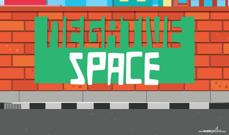
Negative space is something that is never absent, whatever style you use. It’s basically an element of design. Creative use of negative spaces doesn’t just show an artist’s mastery of minimalism; it is also a testament of how much an artist can say with so little.
Combining a few elements to create the positive space and having the negative space frame the subject (or vice versa: making the subject the negative space) evokes a sense of balance of the composition that would otherwise be nonexistent in heavy, almost cluttered design.
The great thing about using negative space is the fact that it needs to be looked at for more than a moment to appreciate, but once that realization comes to the viewer, there’s a sense of achievement for the piece and the artist: you.
Bonus infographic:
8 New Graphic Design Trends That Will Take Over 2017

courtesy of: Venngage.
2017 may be the year for graphic artists to reach out towards new and interesting styles. If you can fuse together two—or more—of the items in this list and make it work, then that’s a benchmark of success you can use to fuse more styles. It will be difficult, sure, but that hasn’t stopped pioneers before. If you think your skills are up for it, and it makes you feel confident, invent a style that is uniquely yours. Set that trend. Be immortalized in your artworks forevermore.
Author Bio:
Rick Enrico is the CEO and Founder of SlideGenius. He regularly publishes expert presentation tips on the SlideGenius Blog. You can connect with him on LinkedIn and Twitter.
Thank you, the info graphic is a very good idea to get the way faster.
ReplyDelete