

Lead generation can be a nightmare sometimes.
In an ideal scenario, a potential customer comes to your website, learns all about you, converts, becomes a customer, and you get to have an amazing customer relationship with him.
But let’s be truthful here - a lot of times, customers come to your website, hoping to have an amazing customer journey, only to get lost! This happens if your conversion path is not clear.
This is where CTAs come in; They take your potential customers to a landing page where they can enter their contact information or complete any short form.
A call-to-action is a link or a button that is placed on your website to convert prospective buyers to leads. Also, a CTA acts as a bridge between the content that your customer is interested in, and a landing page that persuades your customer to complete a form.
Designing CTAs is a skill in itself. Given the fact that humans have a shorter attention span than a humble Goldfish, a CTA must capture a visitor’s attention as fast as possible. Also, a CTA must be in-tune with other elements on the page and must be effectively designed.
A great CTA is a combination of great text and an effective design. To give you a dose of inspiration for designing CTAs, we’ve listed out 15 CTAs that totally nail it!
Effective Text
1. Get Specific
Words like “enter” and “submit” have become things of past! Use an action-packed verb to get the visitor’s attention immediately. Your action words must go along with your subject text. To make your CTA brim with effectiveness, be more descriptive about the action. Tell what the user will be getting if they click through.Here’s an easy trick to do it - use verbs that reflect a benefit and an action that you want your visitor to complete.
For example, instead of “Sign Up with XYZ”, try using “Reserve your Place with XYZ Now!”.
Learn From - Ekklesia 360
Look how convincing “See How it Works” is! It reflects what the Ekklesia wants the visitor to do. Should we even mention the text above the CTA is as convincing as the CTA itself.
How not to do it - Macy’s
This page is about everything! The cluttered layout and too much text will make you miss the promo code. There is a lot of text about furnitures, mattresses and rugs.
2) Make your USP the CTA
What differentiates you from other businesses in the market? What is it that you are actually offering to the customer apart from the product itself? Try making these your CTA text. Your value proposition might be “Free” or “More” or “Increase”, figure out how to display it the best in your call-to-action button.Learn From - Netflix
Look how Netflix uses the word “Free” in its CTA. Also, the CTA is very clear in conveying that the subscription is free for a month only. But, look at the text above - it says “Cancel anytime”. With that reassurance, why wouldn’t you join free for a month?
3) Consistency is the Key
Consistency is very important when it comes to CTA copy. You make to make it very clear to your visitors what they have to do next and why they must do it and so, your CTA must directly reflect the essence of the content that came before it. For example, if your CTA button is at the end of a blog article titled “X Ways to Boost Your Facebook Following” and you want people to sign up for a webinar about social media marketing, don’t feature a CTA that just says, “Sign Up for a Webinar”. Make it reminiscent of the content above like, “Boost your Facebook Following with this free seminar”.Learn from - Neil Patel
Look at how this text and CTAs as consistent throughout the page. The CTA is clear and synchronous with the tone & subject of the page.
4) Create a Sense of Urgency
Change your CTAs such that it creates a sense of urgency, NOW! You only have a small amount of time to convince your customers to take action. Hence, you should not offer your customers a chance to procrastinate. An effective CTA will tempt the customer to click on it right then. It is also a good idea to tell your customers what they stand to gain if they take action immediately. How about “Book now to get a 15% discount”?


(By hubspot)

Source: Wishpond.


Bonus infographic:
![Everything You Need to Know About Call-to-Action Buttons [INFOGRAPHIC]](https://s-media-cache-ak0.pinimg.com/originals/ad/5f/54/ad5f546af4759a0de7b42459b4e4cbd1.png)
Courtesy of: Synecoretech.
To conclude,
There is no “One size fits all” CTA element. You need to keep coming up with better versions, keep testing and keep measuring the conversions. Try testing placements, text, colors, size etc. to see how different combinations influence conversion rates.
About author:
Top image: CoSchedule
Learn From - Zynga
Zynga wants you to play. Not later, but NOW!5) Use Personal Language
Let your CTA be all about your visitors and how you’re putting them first. They came to your landing page looking to fulfil a need. Show them that you’re here to fulfil their need with your service or product. Also, your CTA should not feel like it is being targeted to a group. Add a personal touch to plain CTAs to make it more effective. See how different “Sign Me Up For This!” is different in tone from “Sign Up”. According to statistics, the second person “Your” constantly outperforms “My”.Learn From - Wishpond
This pop-up features a bit of information about their landing page builder and the user is immediately shown a CTA, “Build My Page”. This CTA gives the visitor a feeling of possession and puts them in control.Effective Designs
6) Use Contrasting Colors
An easy trick to make your CTA stand out is to highlight it and create a contrast with the surrounding content. Vibrant and energetic colors are great for drawing attention and creating contrast. If you are stuck and can’t decide on a particular contrasting color, look at the most common colors or the schema used on your landing page, and pick the opposite color. If you still can’t decide, bright red, orange and lively green always seem to do the trick!Learn From - Bath & Body Works
The pink background, white text and the green CTA - the entire element is so well conceived and in tone with their Christmas-sy design. We’re particularly impressed with the choice of colors and how the green button stands out from the pink background!How not to do it - Mr.Porter
Here’s an example of how having same colors all over the page could possibly affect your conversion rate. In this landing page from Mr. Porter, the “Shop Now” button doesn’t stand out too well. For an user who is just skimming through the page, the CTA would be non-existent!7) Put it in Place
One very important factor to remember when trying to draw attention on your CTA is its location. While pop-up CTAs have a conversion rate of up to 8%, sidebar CTAs have a conversion rate of 1.5%. If the customer is not able to find a CTA in the right place when they are willing to take action, a valuable sales opportunity might be lost. So, where exactly do you place your CTA? That depends on what the CTA is trying to achieve. If it is for a demo, place it prominently on pages that show intention. If it for a guide book or a webinar, place it towards the end of a blog article.Learn From - General Assembly
Look at how General Assembly has strategically placed the “Subscribe” CTA in the end! While there is another CTA, “View Full-Time Courses”, it is clear that both the CTAs have been created for different actions. While one is placed at the middle of the page, “Subscribe” is placed at the bottom to let the user take-in all supporting information and hence, prompting better action.(By hubspot)
8) Choose the Right Color
Different group of people respond well to different set of colors. While teal attracts people looking for budget options, red-orange attracts impulse buyers. It is very important that you understand the psychology of color and also understand what your average buyers are looking for, before you choose a color. Also, think about the color of your brand. Color association increases brand recognition which in turn, affects consumer confidence.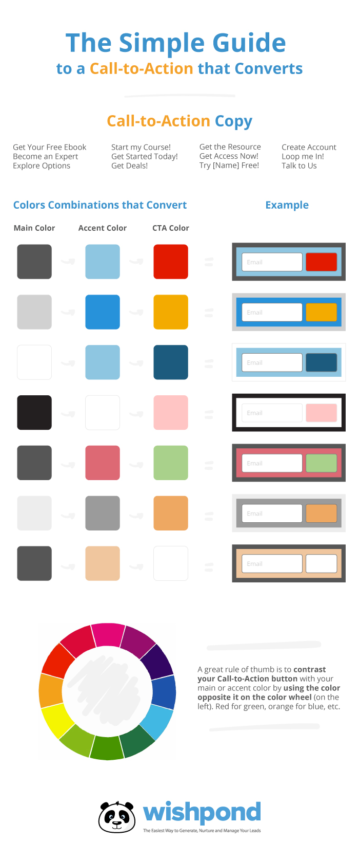
Source: Wishpond.
Learn From - Macys’
Look at how the red color CTA not only contrasts from surrounding elements but also grabs the attention of customers. It is a simple, clear and direct message placed on the right color that does the trick for Macy’s.9) Make it Fit In
Sure, bigger CTA’s scream for attention. But having too large a CTA might get lost due to banner blindness. Make sure your CTA element is sized big enough to read. The CTA size must also be mobile compatible. The key is to make the CTA look balanced with other design elements on page.Learn From - HowAboutWe
Notice how the CTA size is proportional and balanced with other boxes on the page? Now that’s what we’re talking about!10) Button Shape
Users press CTA buttons throughout their daily life, all the time. You need to exploit this fact to create CTA designs that immediately tell the users what to do with it. Even though this is an area you can experiment with, you need to ensure that your CTA button looks like one.Learn from - Wufoo
The background color, the button colors, the neatly formatted text and minimalistic design makes this page a winner. Look at the shape and size of the “Sign Up Free” CTA button that makes you want to click on it!How not to do it - Basecamp 3
Albeit a negative lesson, Basecamp’s CTA do tells us a few things. Notice the “See what’s new in 3” button that is designed like a speech balloon. Do you think people will instantly recognize that it is a CTA? If you button does not look like a clickable element, chances are people won’t click it.Bonus infographic:
Everything You Need to Know About Call-to-Action Buttons
Courtesy of: Synecoretech.
To conclude,
There is no “One size fits all” CTA element. You need to keep coming up with better versions, keep testing and keep measuring the conversions. Try testing placements, text, colors, size etc. to see how different combinations influence conversion rates.
About author:
Masroor Ahmed is conversion optimization analyst at Invesp, where he helps online businesses to improve conversion rate of their websites and Figpii, an easy to use tool that includes everything you need to improve the conversion rate of your website.
Top image: CoSchedule