

To make this process much easier, I am going to list 20 charts that make choosing and combining colors a breeze. Let's begin!
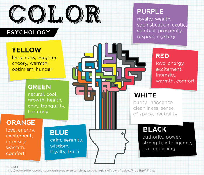
Color Psychology in Logo Design
Colors play a vital role in logo design. The art of mixing the right colors while creating logos can take your brand to the next level. This infographic explains the psychology behind certain color choices.
The Importance of Brand Colors
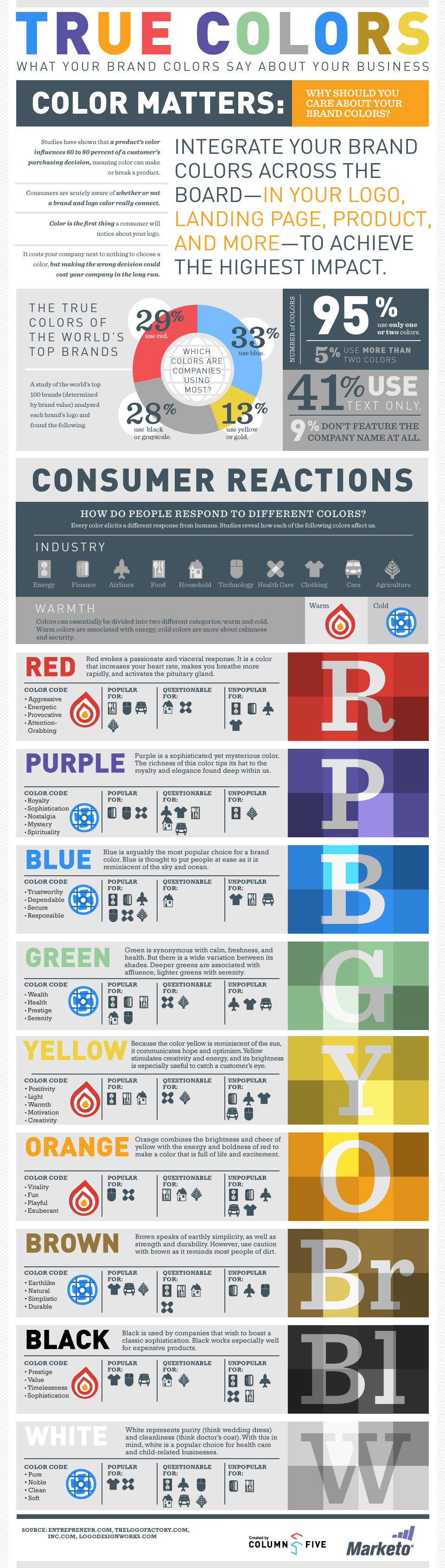
A customer's purchase decision depends greatly on the product's overall visual impression, something color can help establish. This infographic explains the emotional connection and response involved in the use of color for business.
Color Theory
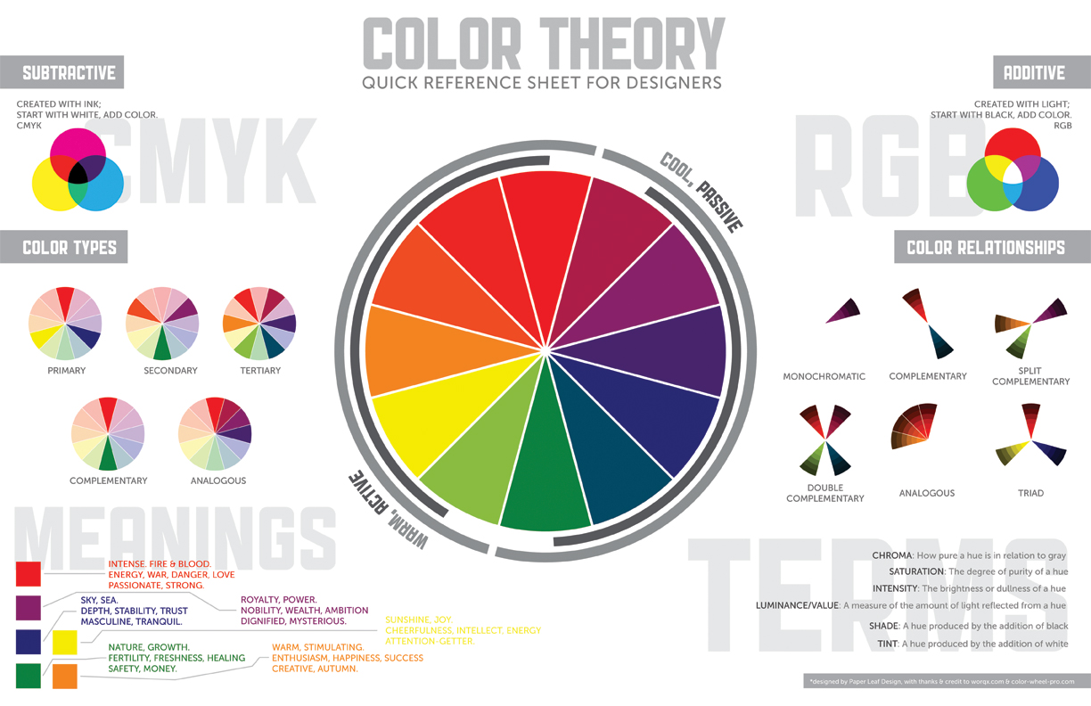
This color chart is a quick reference sheet for designers. It explains a range of color tones from cool to warm. You will also find some basics about color combinations, and references for technical terms like primary, secondary, and tertiary colors.
The Missing Cheatsheet For Brilliant Color Combinations
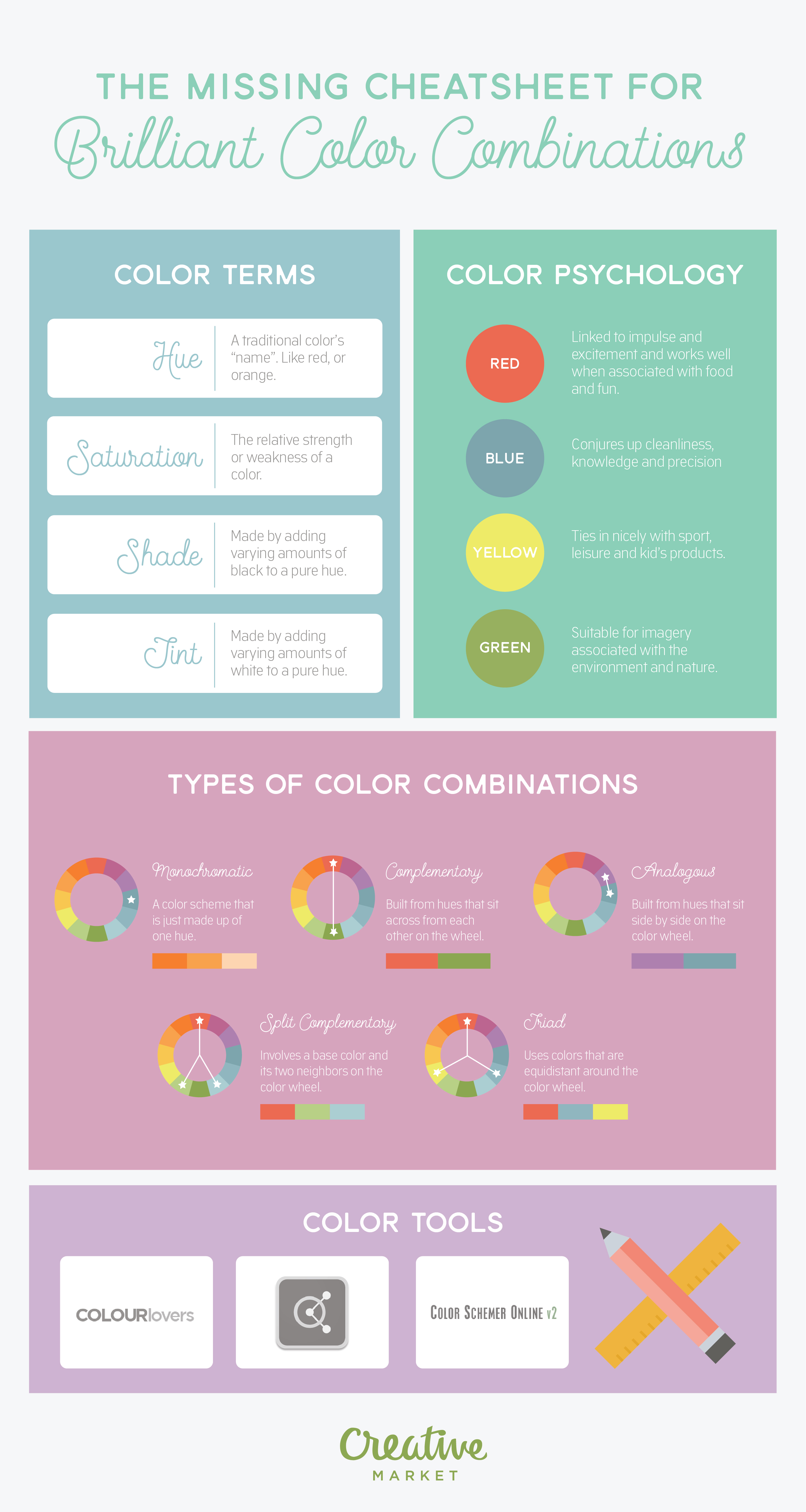
Brilliant color combinations require an understanding of color psychology, terms, and palette types.
What Does Your Favorite Color Say About You?
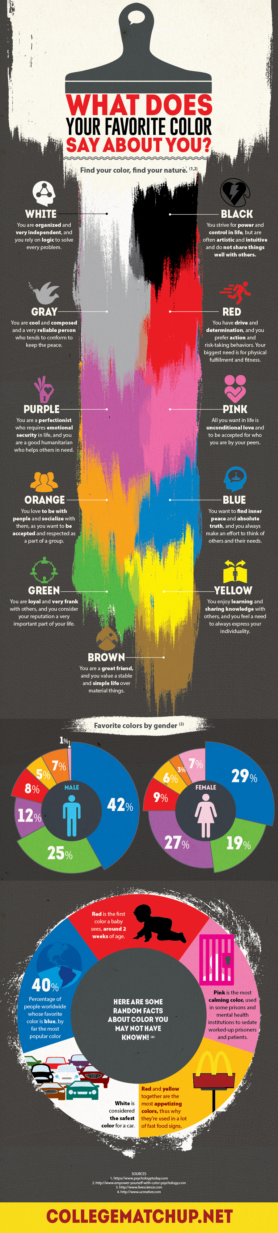
Certain colors create unique sensations. Some make you feel comfortable while others add stress. This infographic explains color preferences that go with your personality type.
The Best Color for Your Bedroom
While choosing bedroom colors, you may prefer ones that are a bit funkier and fresh. However, don't ignore the impact of color on your sleeping times.
Improve Learning with Color
It is quite surprising to know that color affects your learning practices and can hinder or improve them.
Color Psychology — Style Your Room; Design Your Mood
The impact of colors on our mood and emotions is an important aspect of interior design. Without its understanding, you cannot come up with a kick-ass design. This infographic will guide you in the right direction.
Cultural Palette of Colors
When it comes to creating a globally informed design, it is useful to understand the cultural psychology of colors. This color chart will help you explain the significance and associations with different shapes, symbols, and colors around the globe.
Coloring Your Home
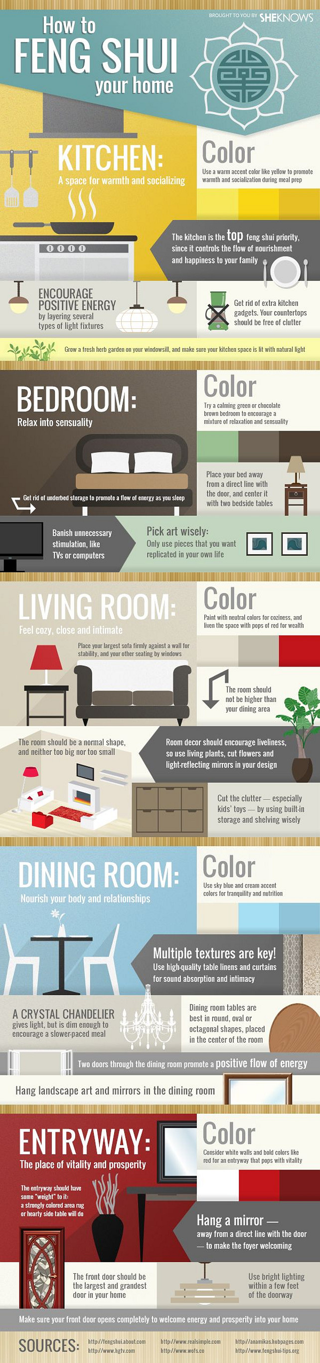
This interior design-focused infographic explains how different colors can be blended to establish certain moods. These principles are also at play in other design applications.
How to Choose a Color Scheme?
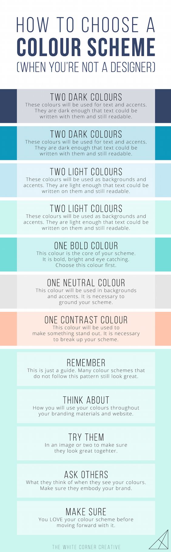
This infographic provides a handy guide to create a cohesive color scheme, including dark, light, bold, neutral, and contrasting colors.
Pantone Predictions 2016 Color Forecast Cheatsheet
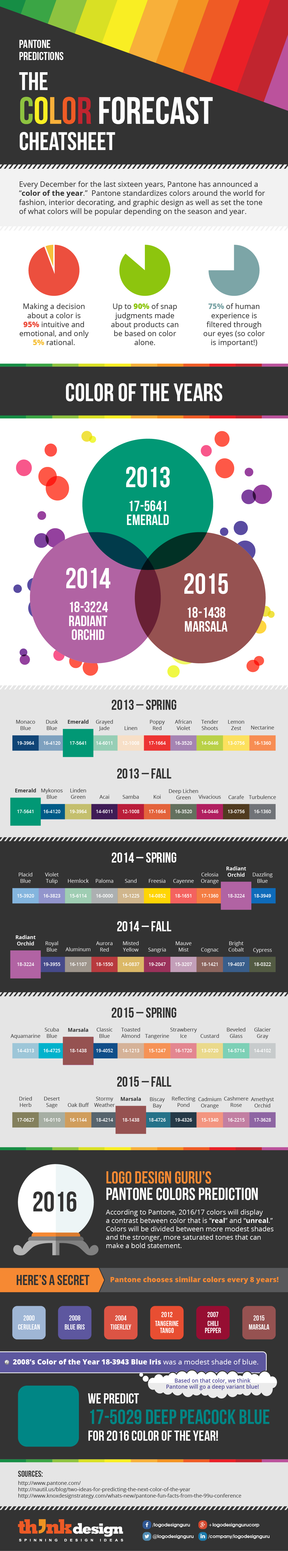
Pantone has predicted colors and trends that affect the design industry for years. This chart summarizes some of their last predictions.
Printing Terms Color Quick Guide
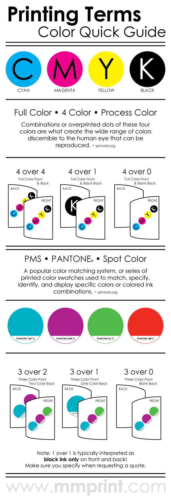
This color chart explains the common printing terms for color processes. These are quite handy for use in the printing world.
How Colors Do Affect Purchases?
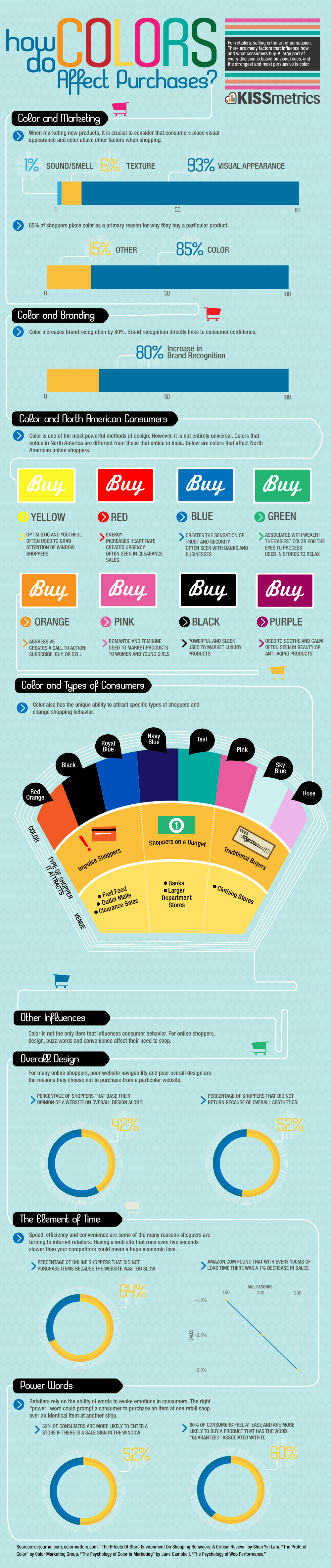
This chart explains the psychology behind how colors affect your product's purchases. While marketing your products, take special care about color choices and how they can help improve sales.
The Art of Color Coordination

It is crucial to learn the art of color coordination, as the individual impact and connotation of certain hues can change (for better or worse) when paired.
How to Choose Colors?
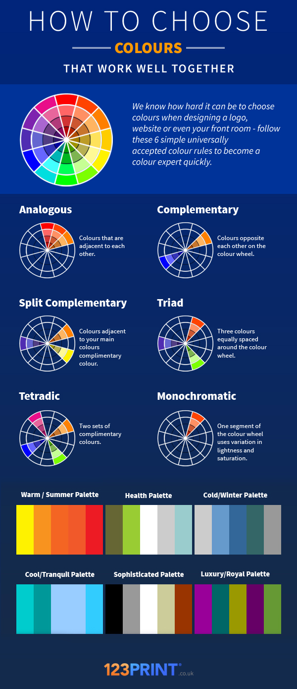
Choosing colors that work well together is a form of art. Certain combinations can convey sophistication, luxury, coolness, and even health.
10 Commandments of Color Theory
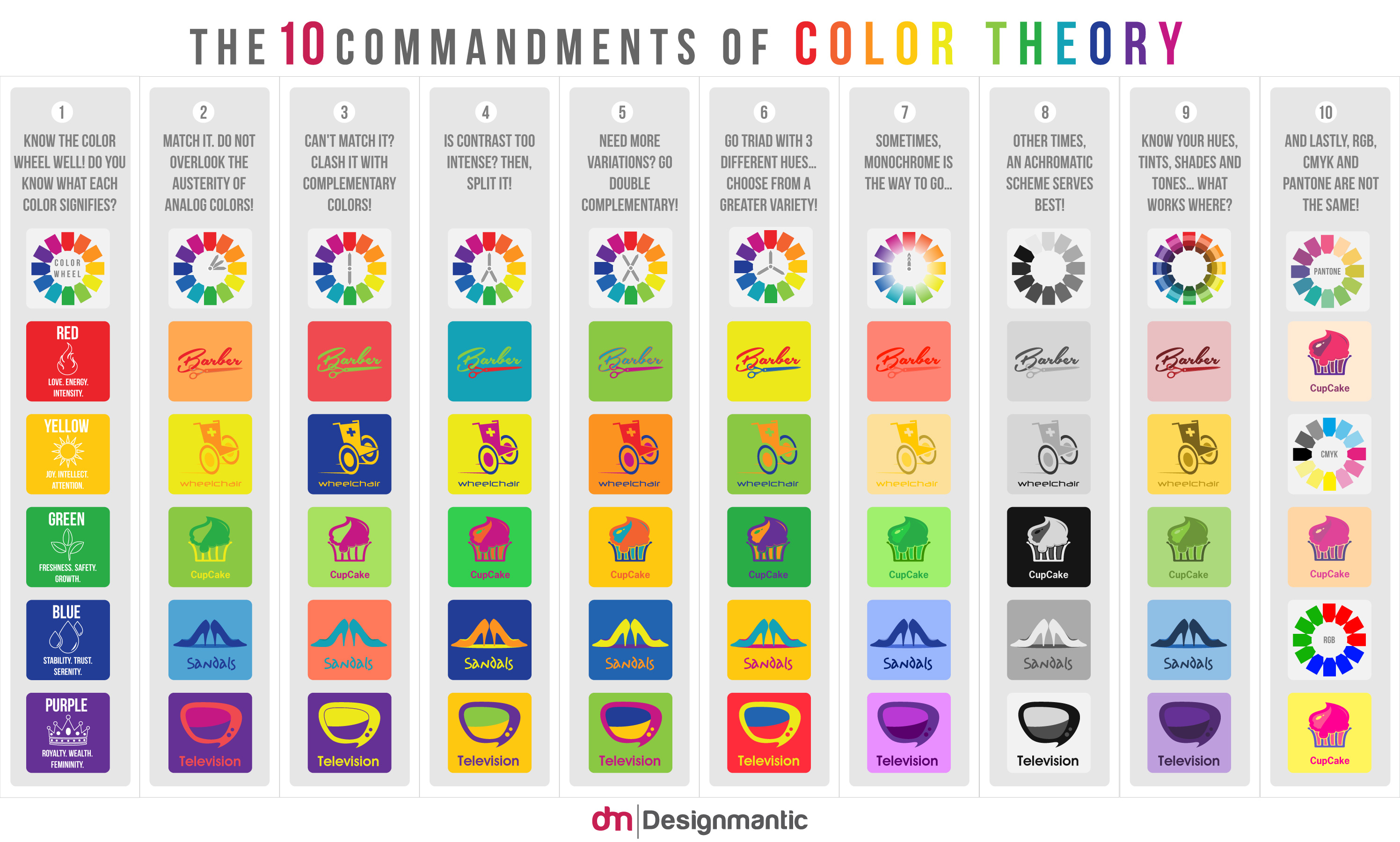
This infographic displays the 10 key commandments of colors, including key advice on contrast, color meaning, hues, and color systems.
Universal Information Graphic Element
It is a set of universal information graphic elements which are available for purchase at Creative Market. It includes a total of 11 different types of information design elements. The product is easy to customize with a resizable grid system.
Color Splash Patterns
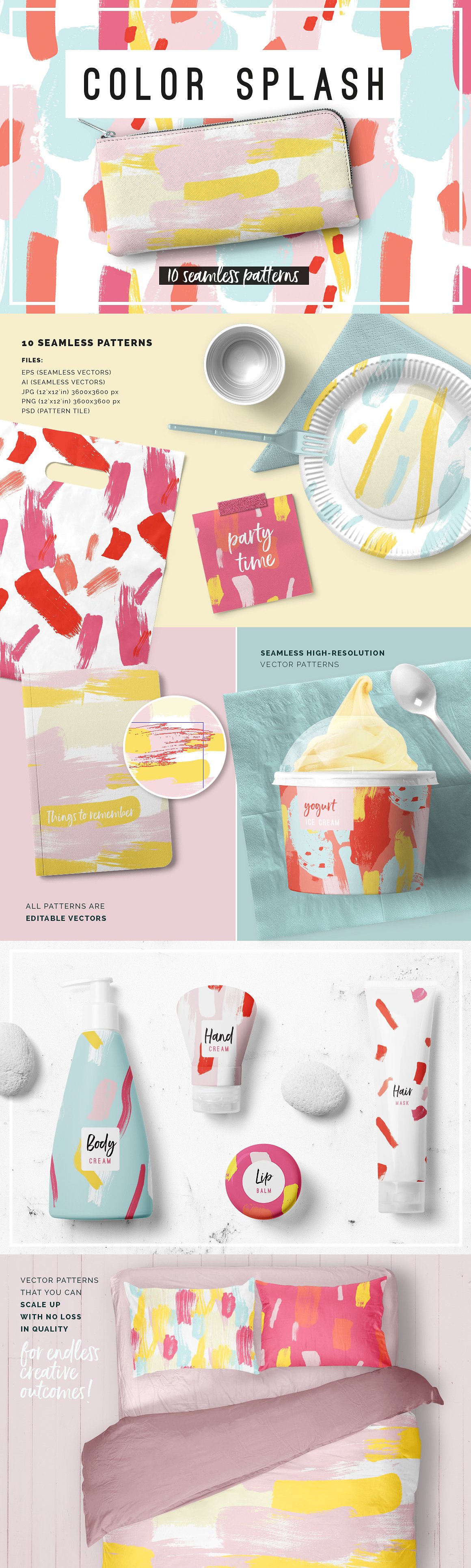
Color Splash Patterns is a set of abstract patterns. They bear a brushed look which is edgy at the same time. All these patterns are in the form of editable vectors and are easy to use. These patterns are best for backgrounds, posters, leaflets, etc. You can purchase them from Creative Market in $14.
Anatomy of the Perfect Office - Color Psychology
Your working space's color palette can influence overall mood. Before designing an office space, spend some time thinking about the perception around specific colors and how they can impact everyone's workflow.
Source: creativemarket