

Throughout the course of a single day, the average American will consume about 63 gigabytes worth of new information. To put that into perspective, that's roughly half of ALL the storage space in a new MacBook Air, or just under the full limit of a mid-level iPhone 7.
Thanks largely to the digital world that we're now living in, we're being bombarded by information from all angles. It's really no wonder that we've become desensitized to even the most alarming statistics.
Take the fact that the 74 million richest people on Earth possess 50% of its wealth. It's alarming, but in a day that was probably already filled with statistics, it just doesn't have as much impact as it should. The real meaning is probably lost on most of us.
Until, that is, you translate it into a visual format. Suddenly, the same information is being presented in a unique - and compelling - new way. People can't help but sit up, pay attention and really think about what it means.
That is the sheer power of a well-designed infographic on display.
But it's important to understand that an infographic is about more than just visual communication. It's a format that effortlessly blends together a number of important design concepts into one incredibly effective package.
If you really want to create the types of infographics that people can't help but share, there are a few key (and simple) things to keep in mind.
1. Define Your Target Audience
Before you can effectively communicate with someone, you have to know who you're talking to. Are you trying to capture the attention of business executives? What about Millennials?Are stay-at-home moms your audience? Your answer will change everything about the infographic design process, as different people respond to things in different ways.
2. Define Your Goals
Next, take the time to really think about what you're trying to accomplish with your infographic. Are you trying to:- Break down complex data in an easier-to-understand format?
- Reveal hidden trends or patterns using data as a foundation?
- Create a comprehensive, visual resource on a particular subject?
- Compare two products or services?
- Translate your brand story (or any other strong narrative idea) into a timeline infographic?
All of these things can be accomplished with an infographic, but they'll require vastly different approaches. Take care to determine the best format to fit your message and intention.
3. Define Your Medium
You'll also want to think about the final delivery medium that your infographic will take. Are you trying to create something perfect for sharing on social media, or do you want to eventually print it out so that people can hand it to team members or coworkers in real life? Both of these will require different design choices, which is why this is a decision that needs to be made now.4. Choose Your Topic
Next, choose a central topic or idea to build your infographic around. Do you already have some type of thesis statement that you're trying to convey that is backed up by data?Do you still have to conduct research into the category in the hopes that your well-supported argument reveals itself? Both approaches are fine, but they require you to design your infographic with a different approach, too.
5. Find Your Data
At this point, you can start finding the data you're going to be visualizing. Take a look at any or all of the following areas:- Interviews that you've conducted with topic experts.
- Press releases.
- Your company's own proprietary data.
- Academic studies.
- Newly released reports.
- Surveys or polls that have been recently published.
Make a note of anything that you can include in your infographic that will help you sell the idea at the heart of it.
6. Find the Story at the Heart of It All
You'll also want to take care to find the narrative backbone of your infographic, so you can build everything from your design to the specific stats you're singling out around this.Arrange your data in the way it needs to tell your story. Eliminate any inconsistencies that may run contrary to what you're trying to accomplish. Think about what order things would have to go in to show changes over time, the differences or similarities between items and other trends and patterns.
7. Pick the Right Infographic Type
Next, find the right type of infographic to fit your needs. You can choose from a list format, a flowchart, visualized numbers, photo graphics, "how to" infographics, mixed charts, timeline infographics and more. By now, the right format to support your goals should essentially reveal itself. If you've properly uncovered the story beneath your data, you shouldn't have much of a choice to make at all.
8. Write Copy For Your Infographic
Sum up the main message of your infographic in a few sentences, providing necessary context for the journey your readers are about to go on. Take an opportunity to really flesh out the narrative - while most of your data will speak for itself, sometimes clarifying statements can really help with impact. Start with an inciting incident, move onto your complication and then bring it all home with your resolution - taking the time to make sure that the "action" of your narrative is rising and falling at appropriate points.
Build an airtight case for your argument and pay close attention to tone - this is where knowing your audience will come in very handy.
9. Create a Wireframe
Now, start translating that text into visual elements. Use a tool like Visme (which in transparency, I’m the founder of) to create a barebones mockup or sketch of the structure of your final design. Think of it like a rough draft - once all of the pieces are in the right place, you can then use further design concepts to make everything look and feel exactly how you wanted to.Keep building upon that foundation until you're left with an infographic that is every bit as good as it was in your head when you originally conceived it.
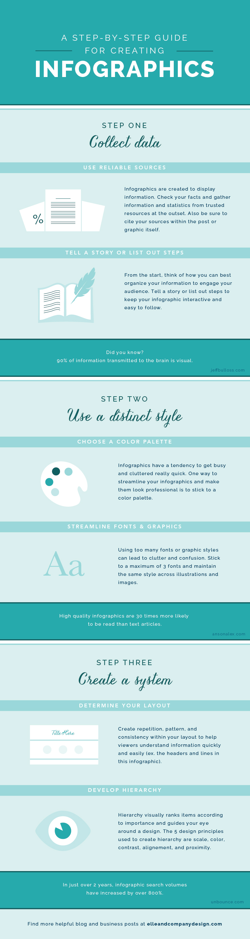
Bonus infographic:
About the Author:
Payman Taei is the founder of Visme, an easy-to-use online tool to create engaging presentations, infographics, and other forms of visual content. He is also the founder of HindSite Interactive, a Maryland based award-winning digital agency specializing in website design, user experience and web app development.