
Microsoft is adding in newly redesigned hardware indicator flyouts for Windows 11, which seem to strongly resemble the ones that can be found across macOS devices.
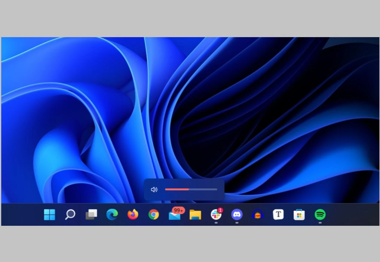
Hardware indicator flyouts, for those individuals unaware, is essentially technical jargon for a device’s indicators that something on the outside has been interacted with. For example, remember when you pressed the volume key on a laptop and a small volume bar showed up on the upper left corner of the screen back in Windows 10? That volume bar is your flyout: it indicates that hardware has been interacted with, and is thus working. They’re not exactly the most important design aspect of smartphones and laptops, but hardware indicator flyouts contribute a lot of personality to a device’s interface and overall look & feel. The minimalist brightness symbol, with markers being set by small individual squares, is an iconic look that really spelled out how macOS devices would feel like being used by consumers across the world. Flyouts need to mesh with the overall aesthetic of a device.
For Windows 11, which has added in interactive flyouts for touch-screens and whatnot, such design aesthetics need to be carefully considered if they’re to be well executed. These aren’t just on-screen symbols for users, they’re the literal means of controlling important factors such as sound and brightness. In this regard, the new interface has seen a bit of criticism lobbed its way. Users believe that the new indicator flyouts, which now show up in the middle bottom part of the screen as a very thin line, are hard to interact with via touchscreens and therefore aren’t all too effective. Another issue that users have pointed out is that, other than the fact that the new flyouts don’t resemble any designs Windows had previously shown, what they do seem to resemble is the product of a massive competitor.
Apple has added similarly thin, minimalistic flyouts to its interface, and has done so since a while. The overall aesthetic works better there, since Apple MacBooks aren’t really built to be used via touchscreens. There’s also a bit more distance from the taskbar, therefore ensuring that users won’t keep accidentally tapping on an application while they’re trying to adjust the volume settings. Overall, the indicator flyouts still feel a bit more distinct in MacBooks.
 H/T: Arstechnica
Source: Data Reveals A Record High Smartphone App Usage Across The Globe In 2021
Hardware indicator flyouts, for those individuals unaware, is essentially technical jargon for a device’s indicators that something on the outside has been interacted with. For example, remember when you pressed the volume key on a laptop and a small volume bar showed up on the upper left corner of the screen back in Windows 10? That volume bar is your flyout: it indicates that hardware has been interacted with, and is thus working. They’re not exactly the most important design aspect of smartphones and laptops, but hardware indicator flyouts contribute a lot of personality to a device’s interface and overall look & feel. The minimalist brightness symbol, with markers being set by small individual squares, is an iconic look that really spelled out how macOS devices would feel like being used by consumers across the world. Flyouts need to mesh with the overall aesthetic of a device.
For Windows 11, which has added in interactive flyouts for touch-screens and whatnot, such design aesthetics need to be carefully considered if they’re to be well executed. These aren’t just on-screen symbols for users, they’re the literal means of controlling important factors such as sound and brightness. In this regard, the new interface has seen a bit of criticism lobbed its way. Users believe that the new indicator flyouts, which now show up in the middle bottom part of the screen as a very thin line, are hard to interact with via touchscreens and therefore aren’t all too effective. Another issue that users have pointed out is that, other than the fact that the new flyouts don’t resemble any designs Windows had previously shown, what they do seem to resemble is the product of a massive competitor.
Apple has added similarly thin, minimalistic flyouts to its interface, and has done so since a while. The overall aesthetic works better there, since Apple MacBooks aren’t really built to be used via touchscreens. There’s also a bit more distance from the taskbar, therefore ensuring that users won’t keep accidentally tapping on an application while they’re trying to adjust the volume settings. Overall, the indicator flyouts still feel a bit more distinct in MacBooks.
Source: Data Reveals A Record High Smartphone App Usage Across The Globe In 2021