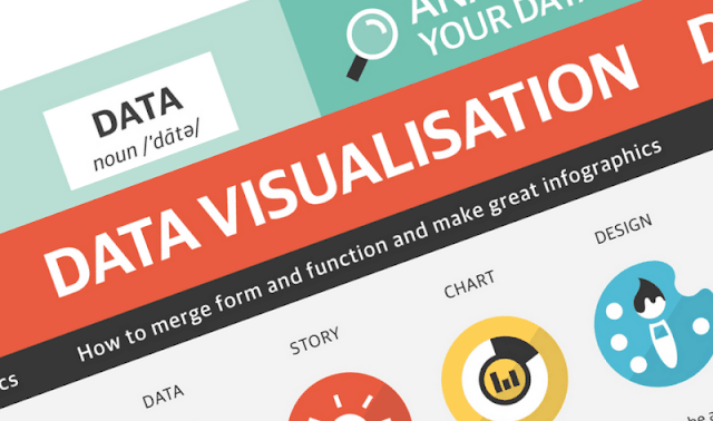
The following infographic, created by Zhenia Vasiliev, breaks down the basics of data visualization. It shows how beginners can merge form and function, and design meaningful infographics.
Key highlights:
Analyse your data: Analysis is the key. Before we can visualize the data we need to understand it.
Come up with a story: Story is finding a single strand of meaning in an endless sea of information. It has a beginning, middle and end.
Make it visible: Visualization is a creative act of making. Making the data visually elegant evident and engaging.
Entertain to educate: Good data design need to illuminate and inform the viewer, elucidate and illustrate the facts and stats.

Infographic courtesy of: Evasilev.

